RECENT WORKS

Cultural Services.
City of Peterborough

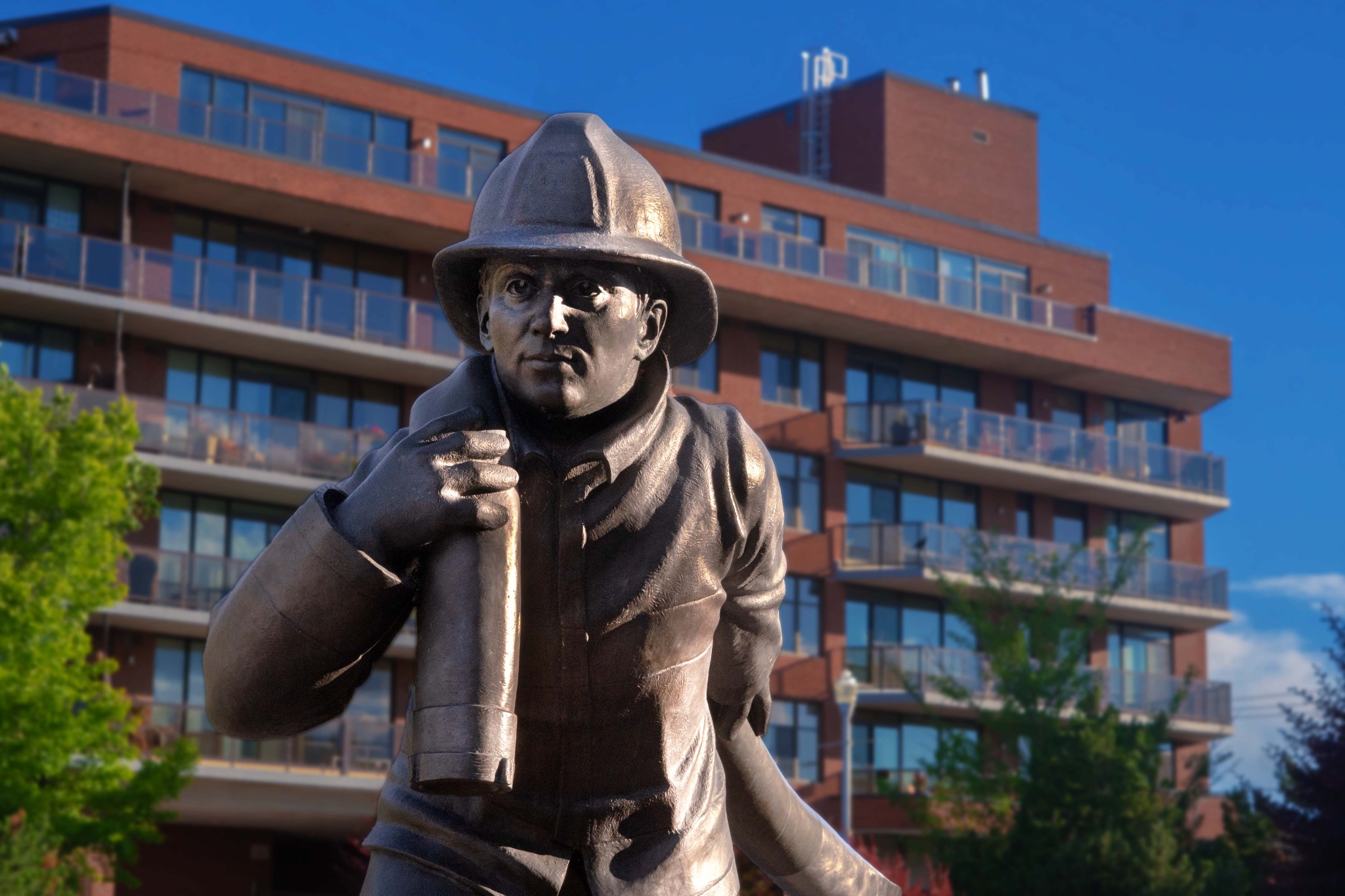
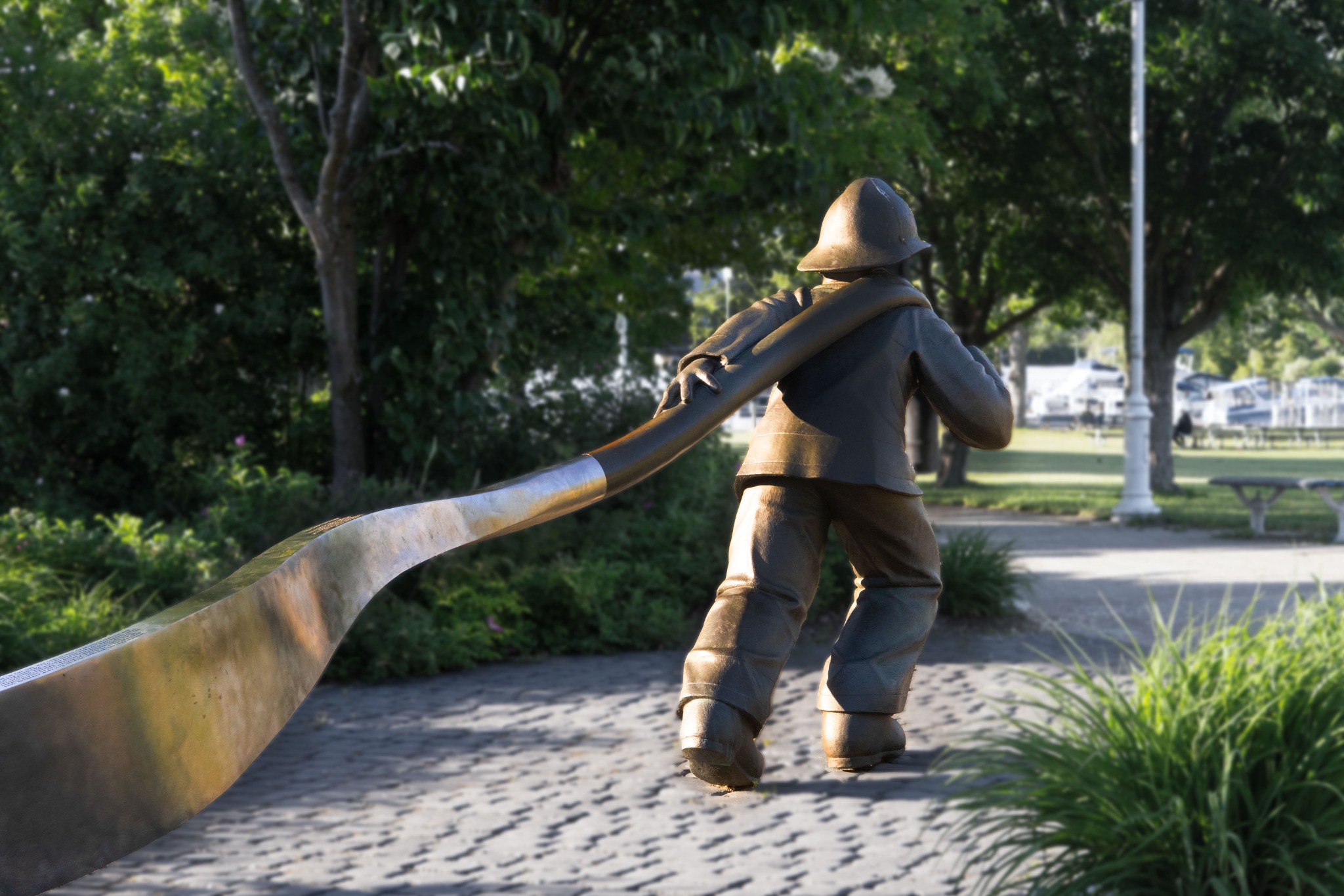
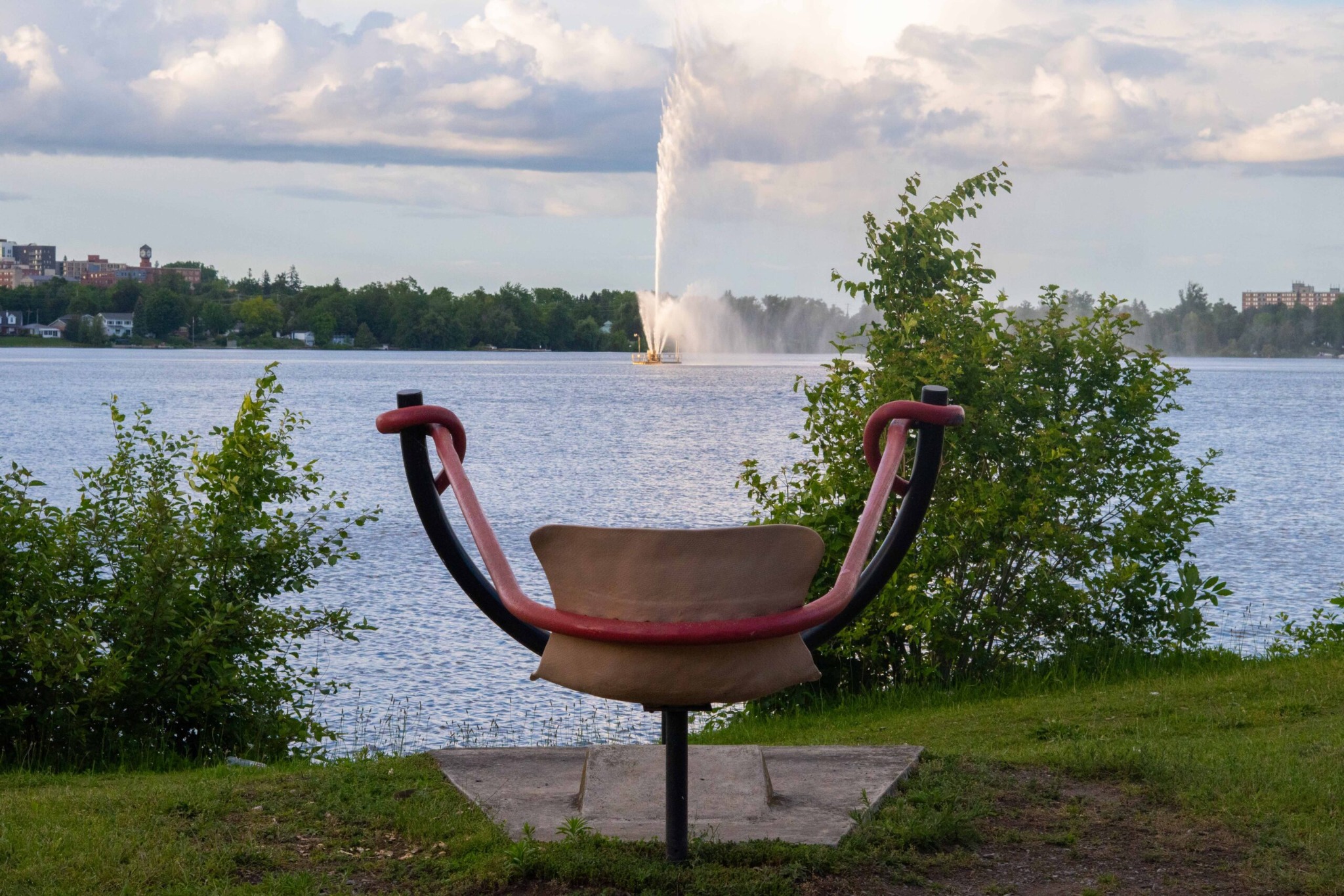
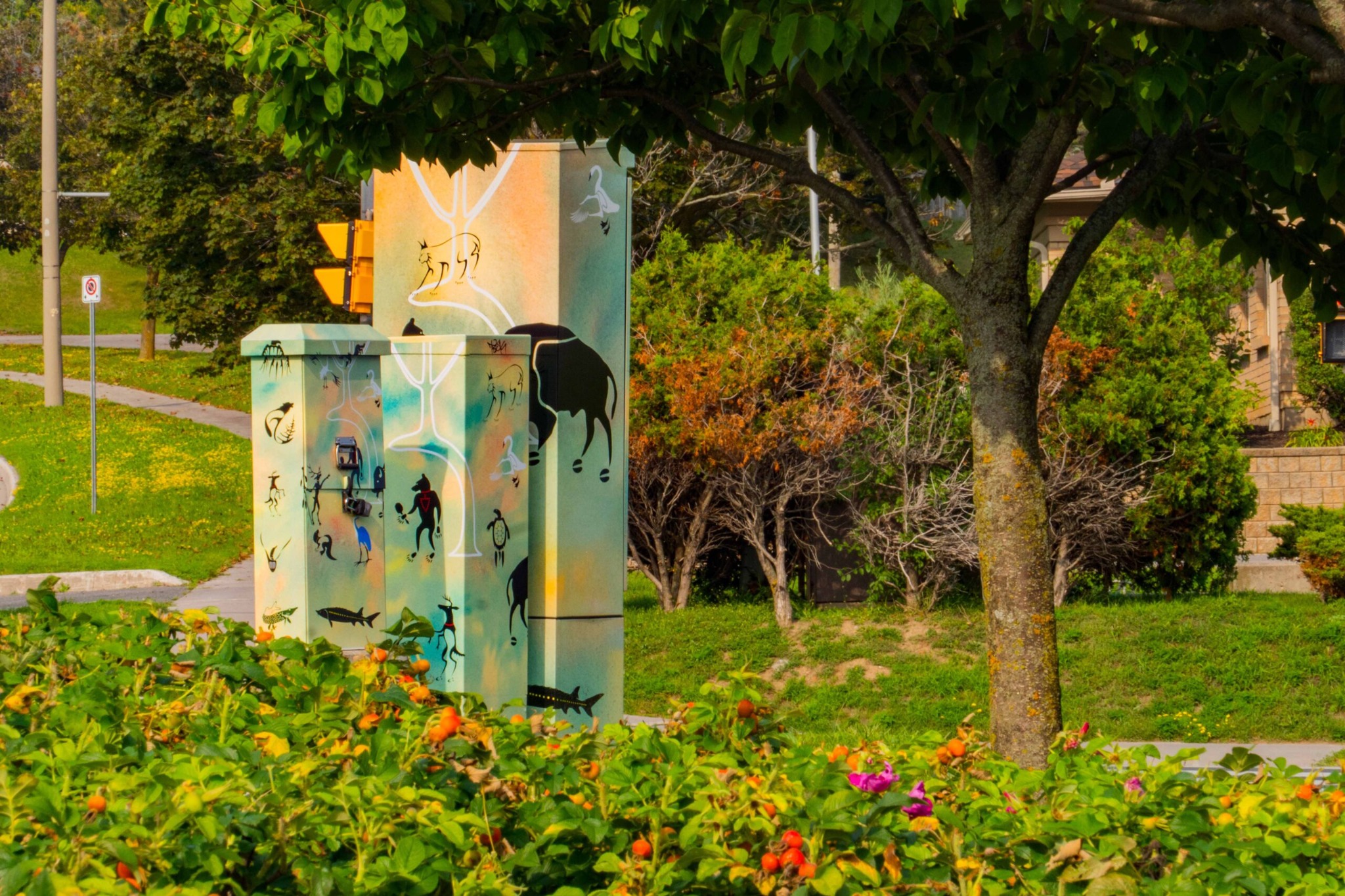
A multidisciplinary documentation project for Peterborough’s public art collection, bringing together artwork inventory, dedicated web pages, photography, and a final video documenting works across the city.
Public Art

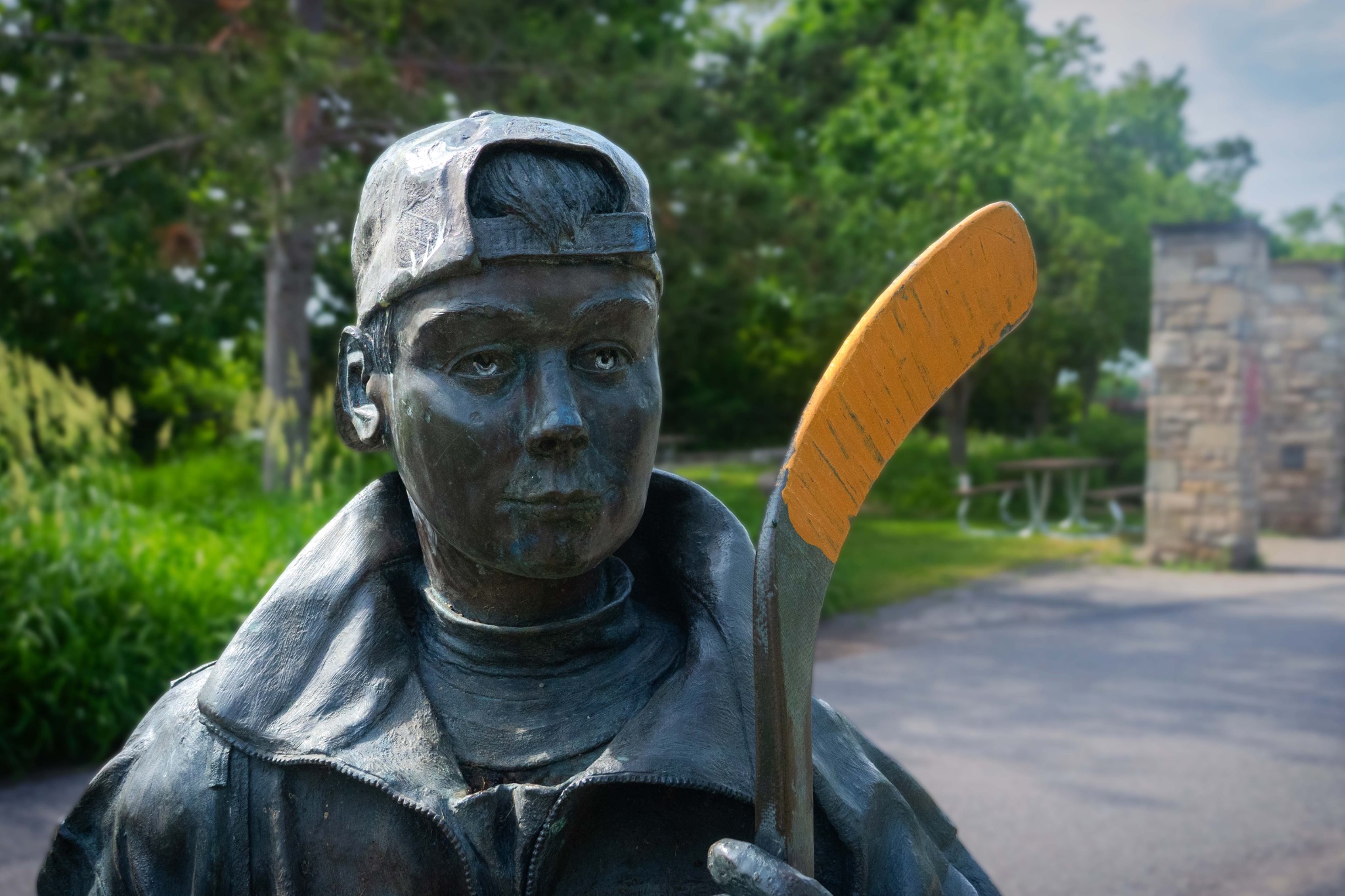
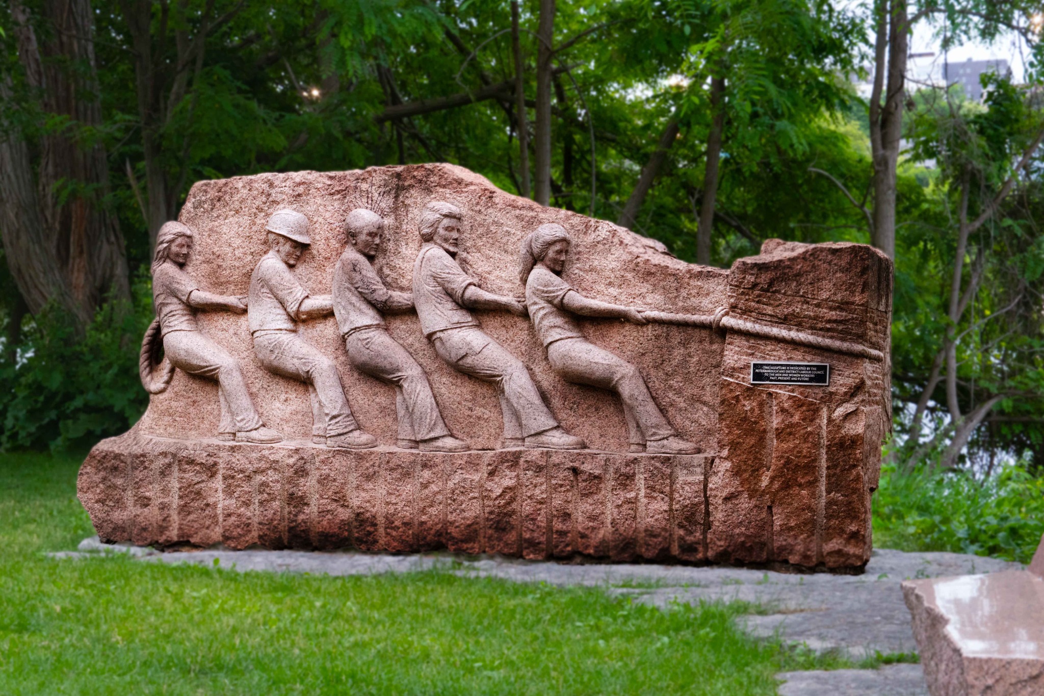
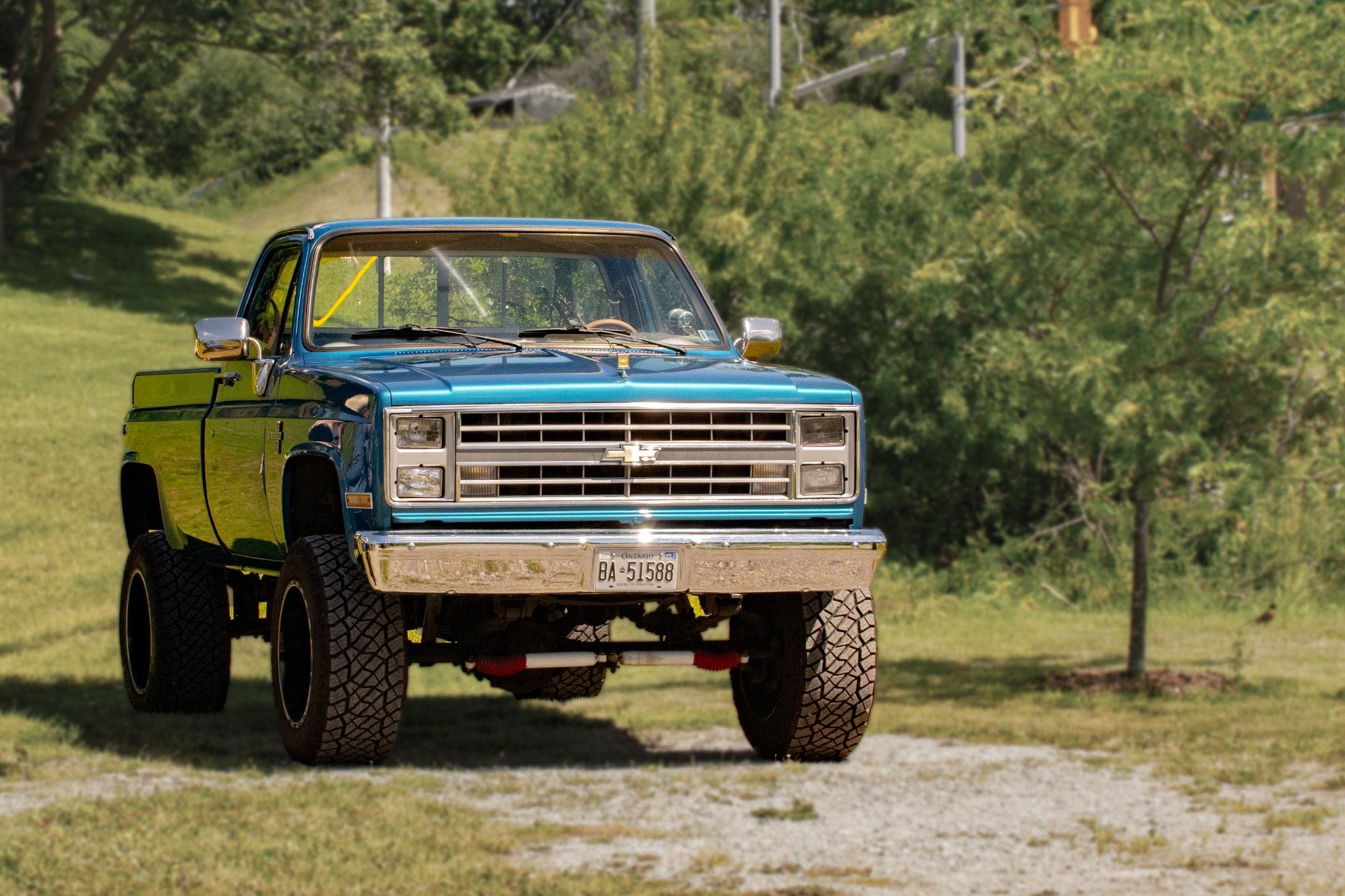
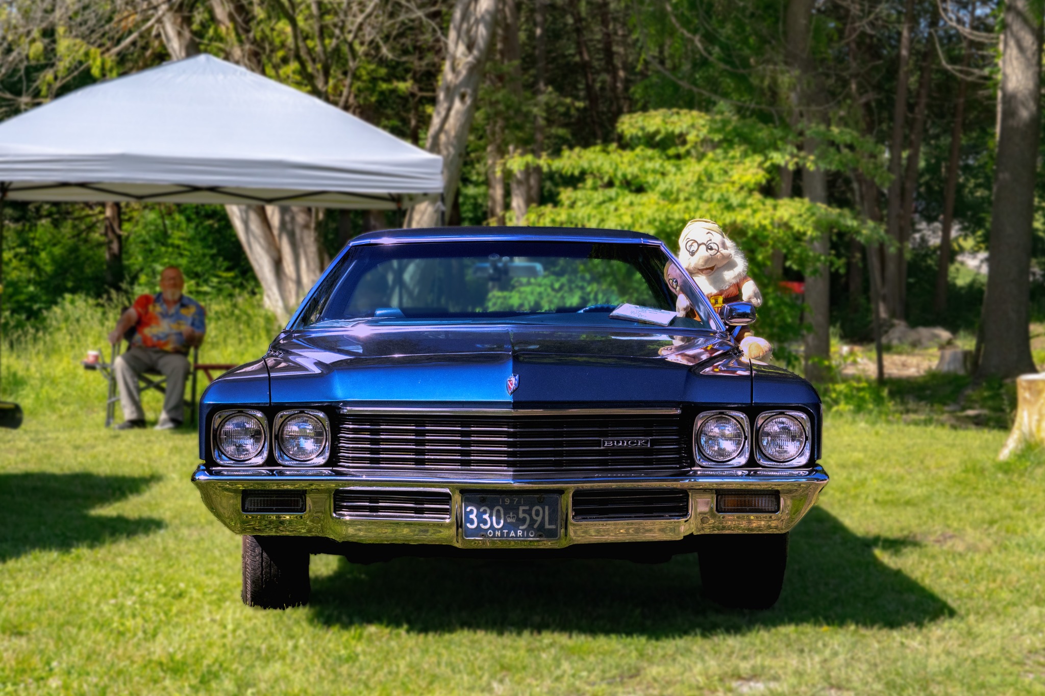
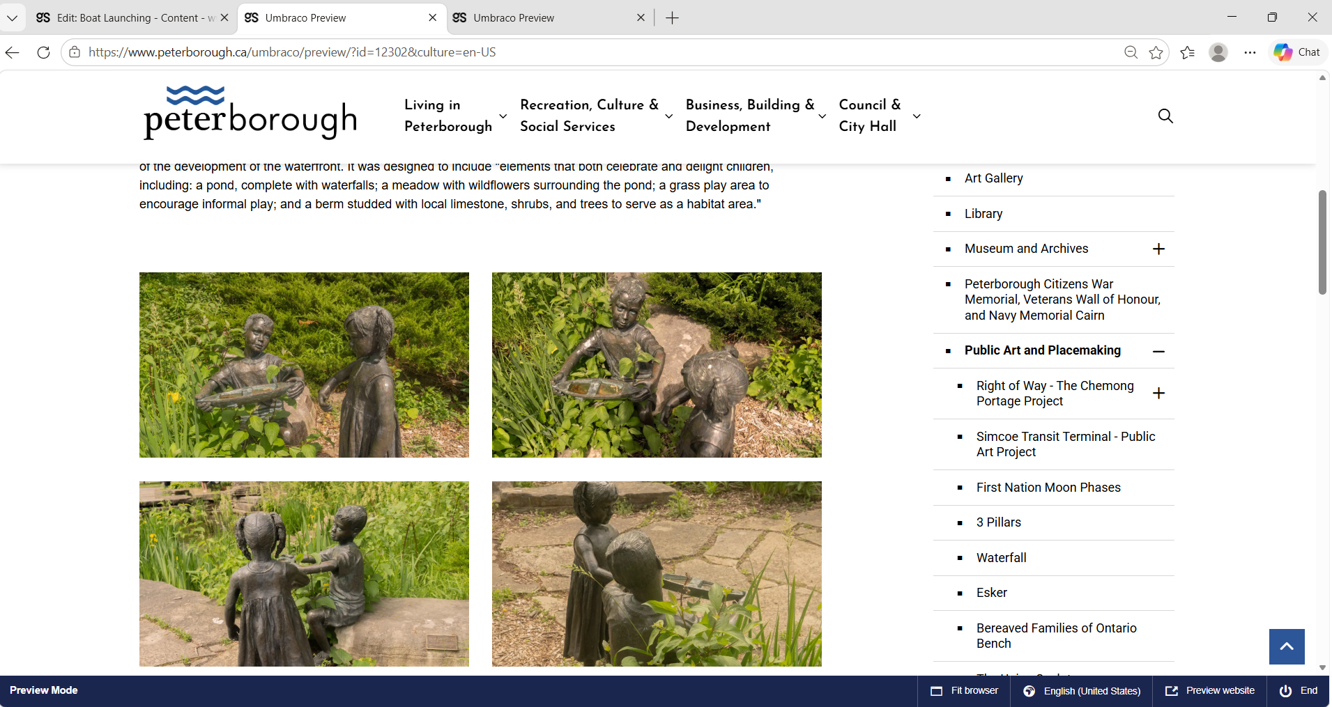
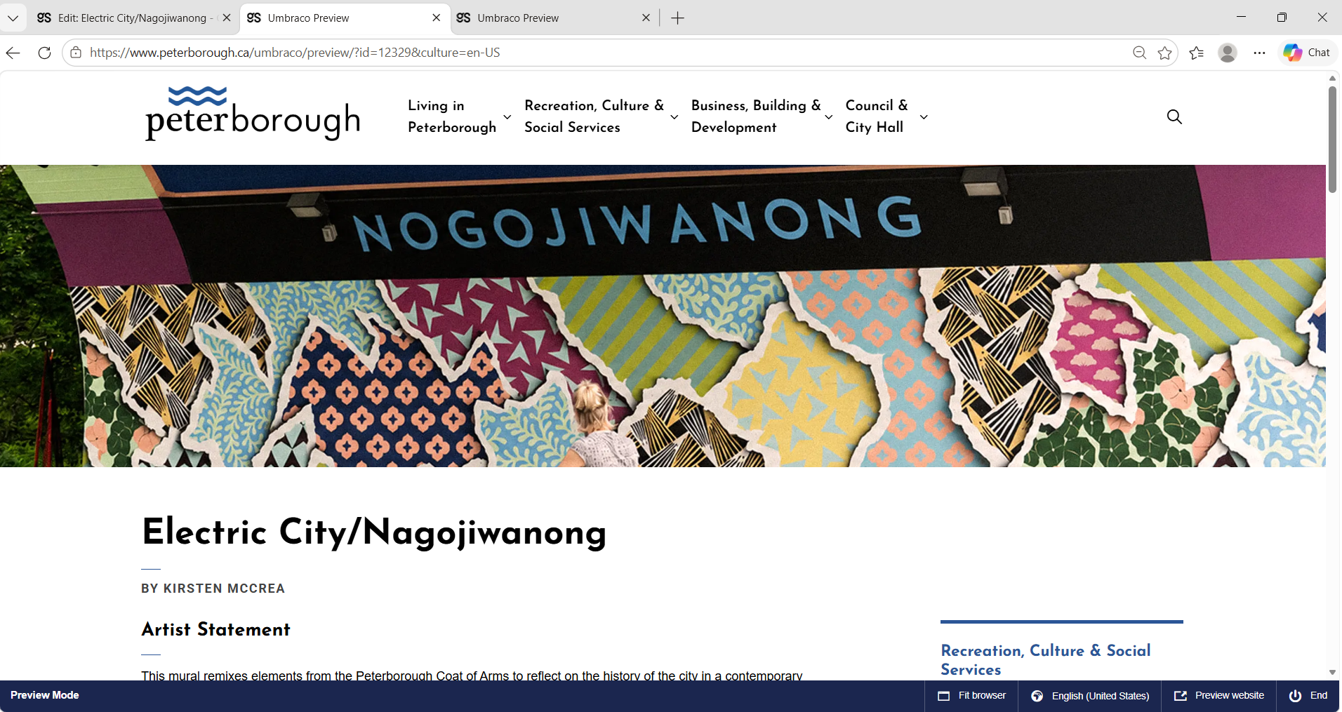
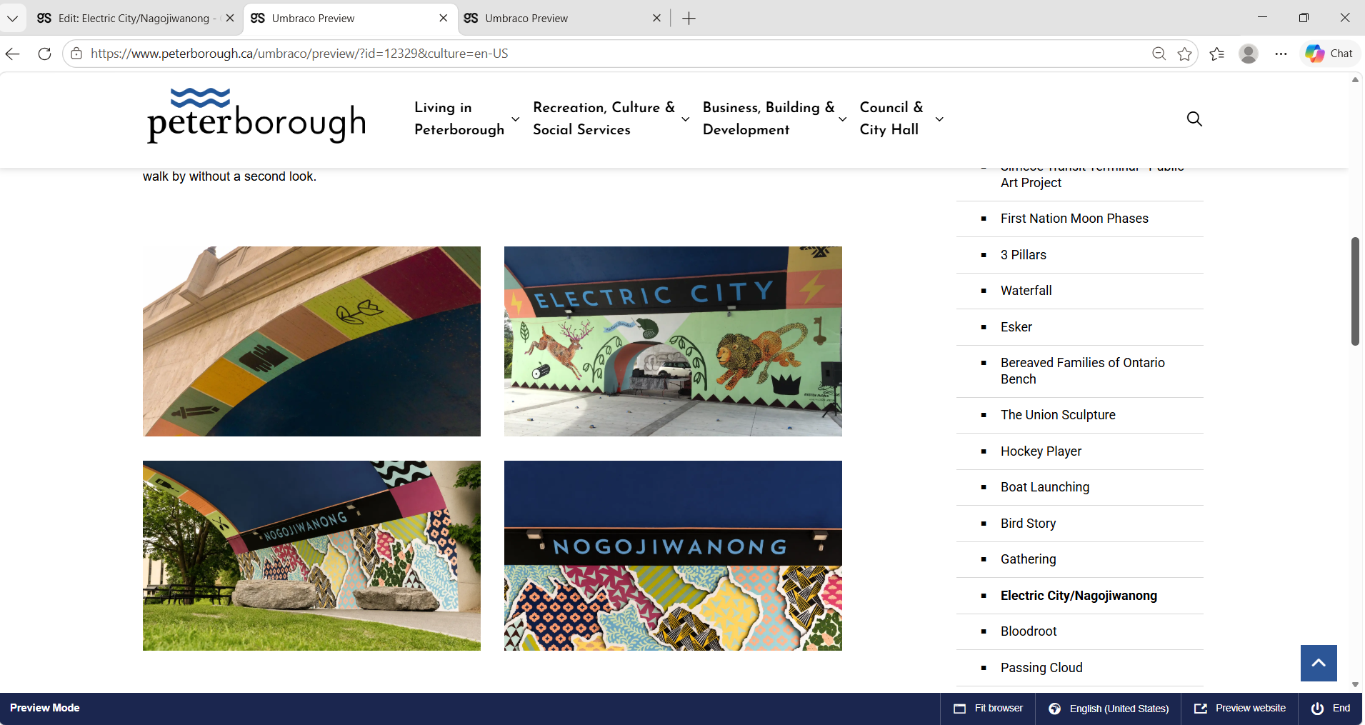
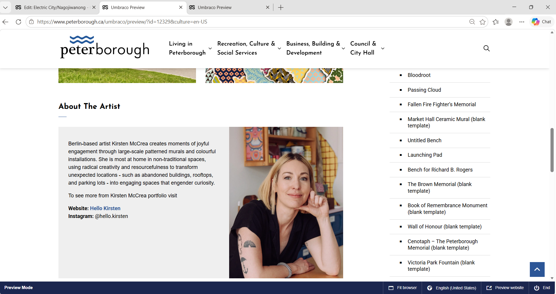
Selected photographs from the public art documentation process — capturing artworks in context and building a visual archive for inventory, web pages, and the final film.

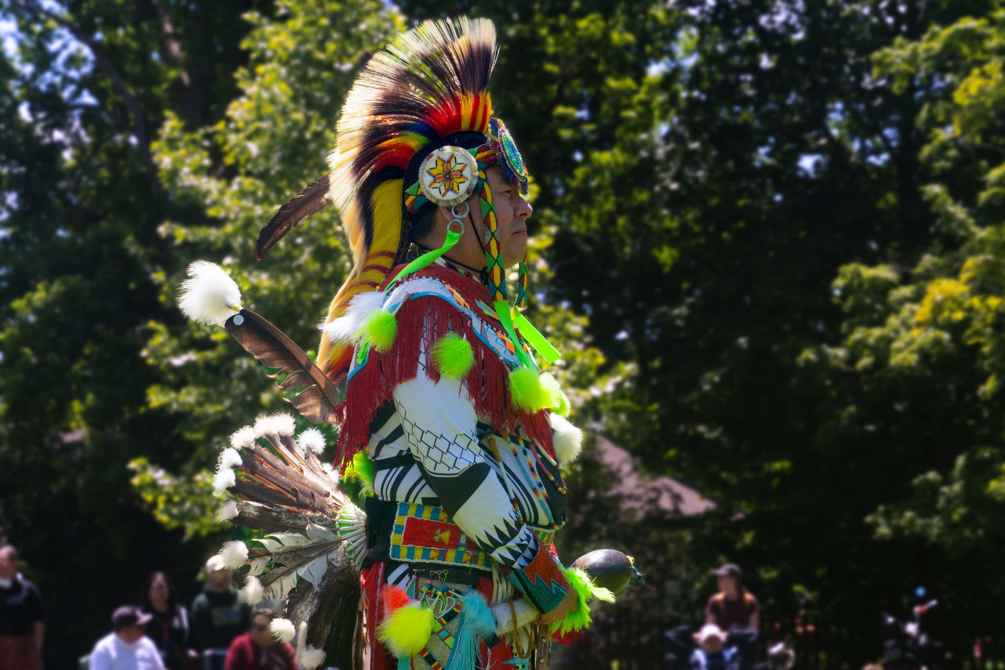
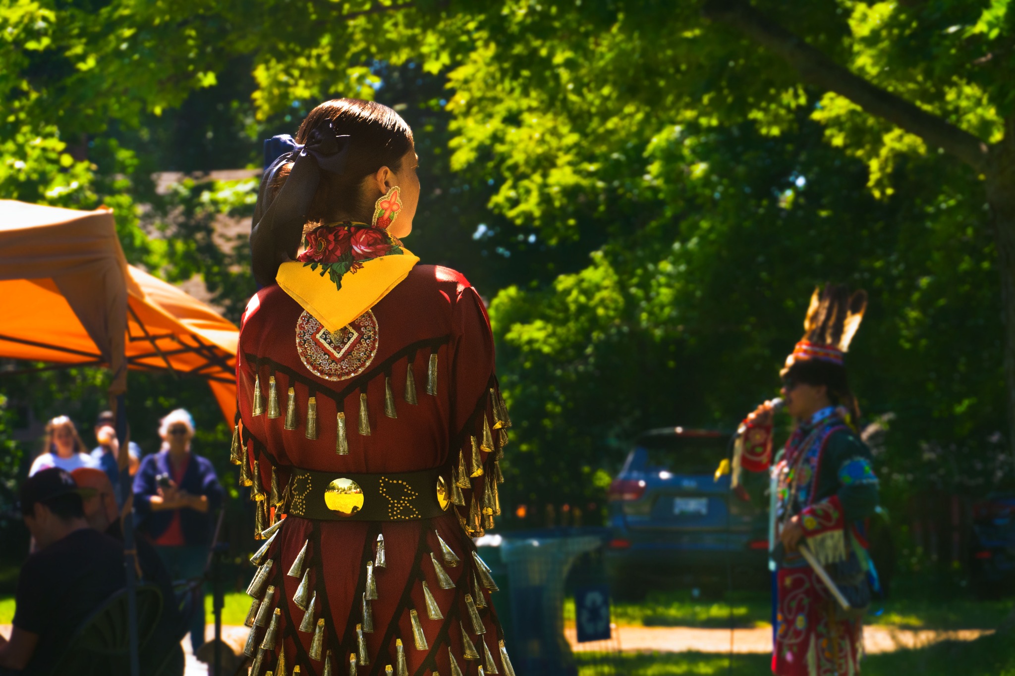
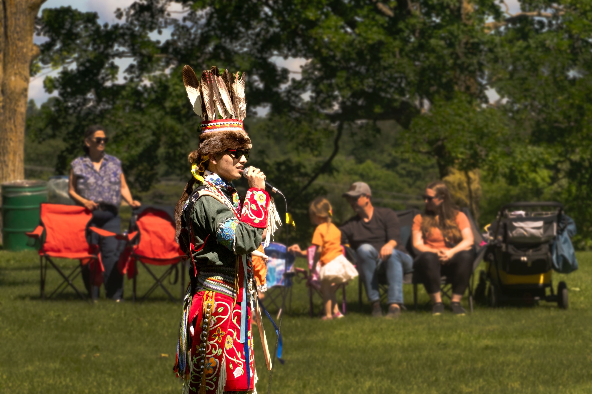
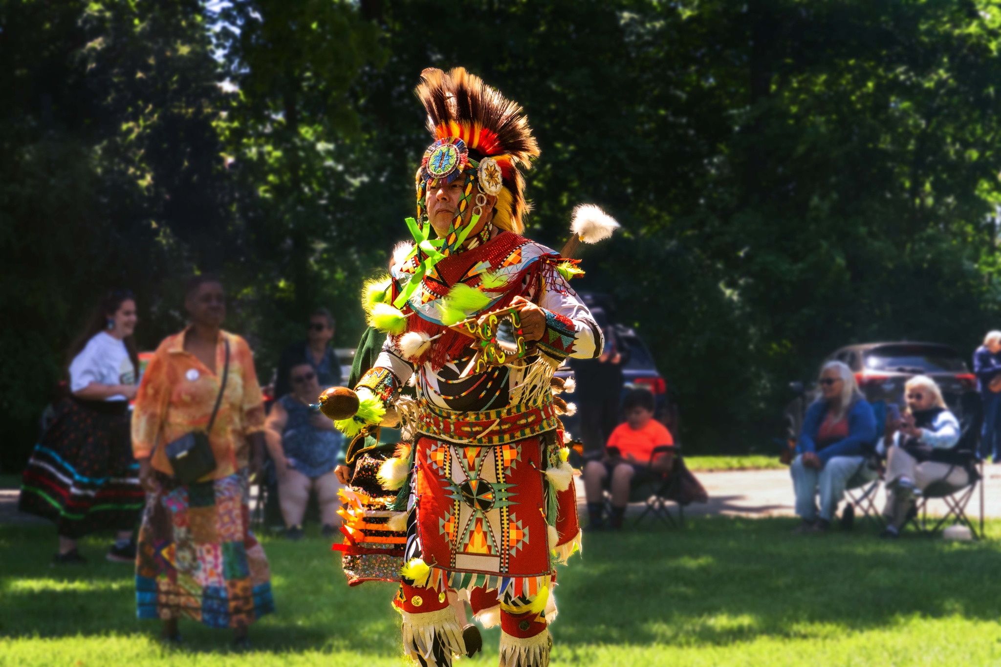
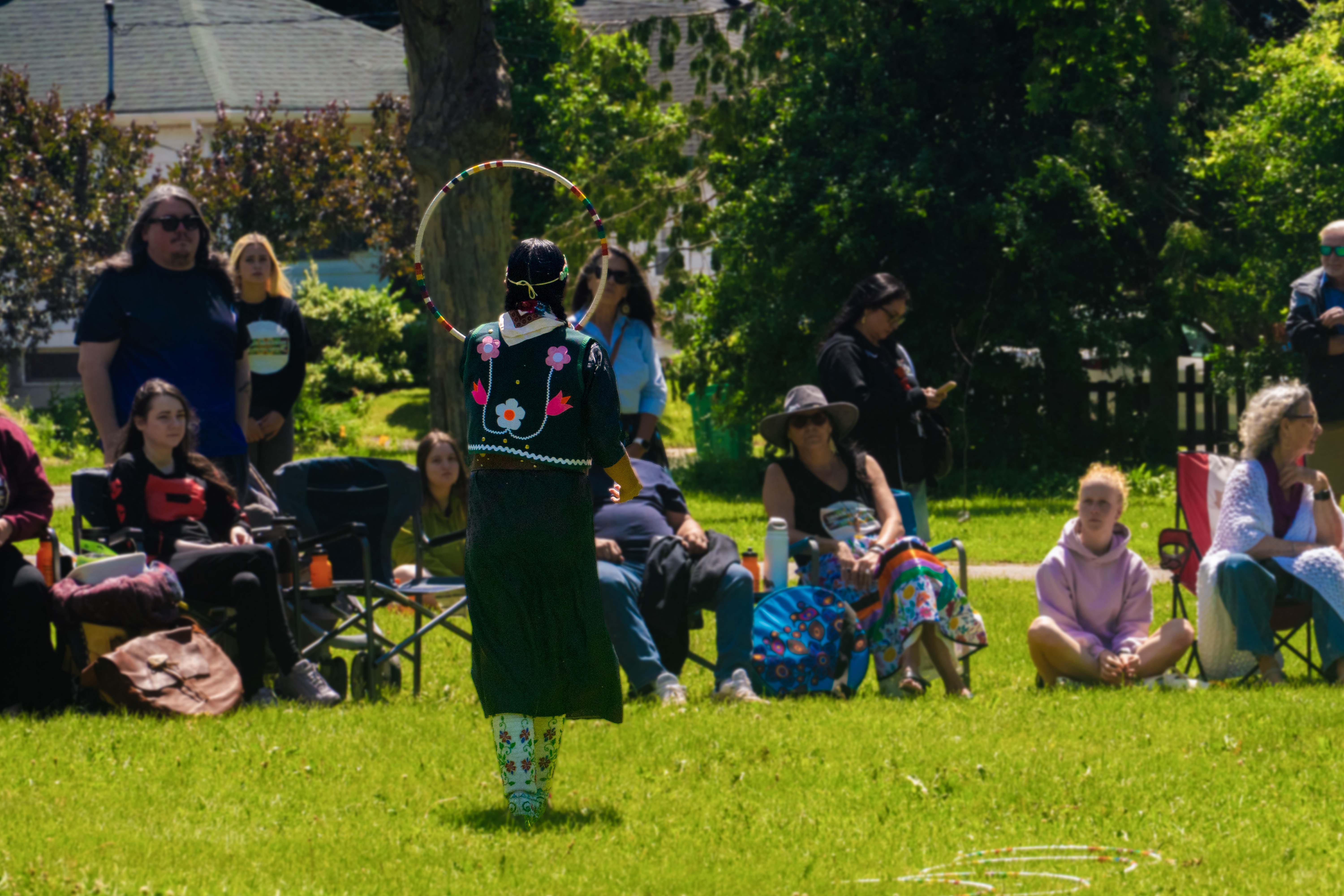
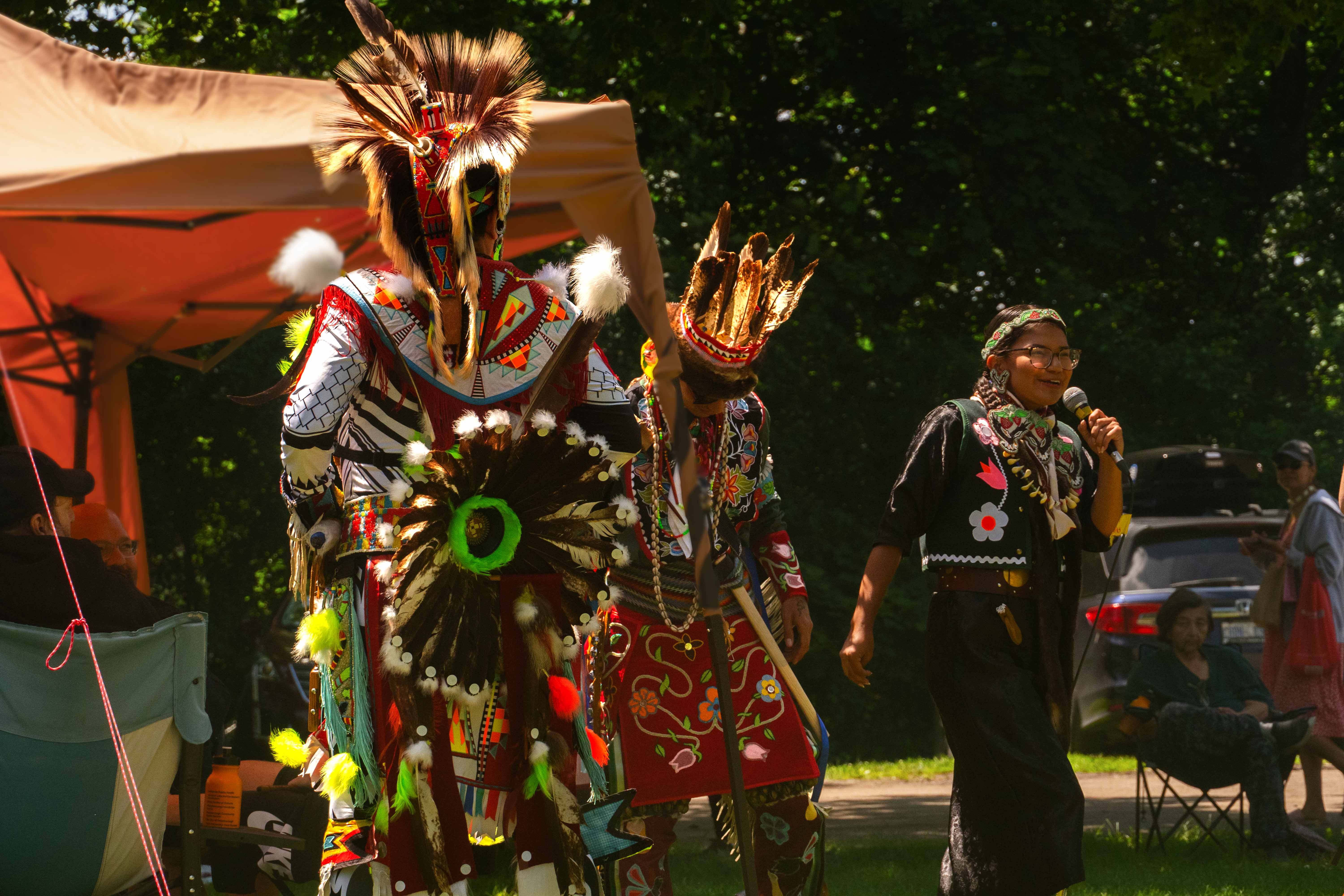
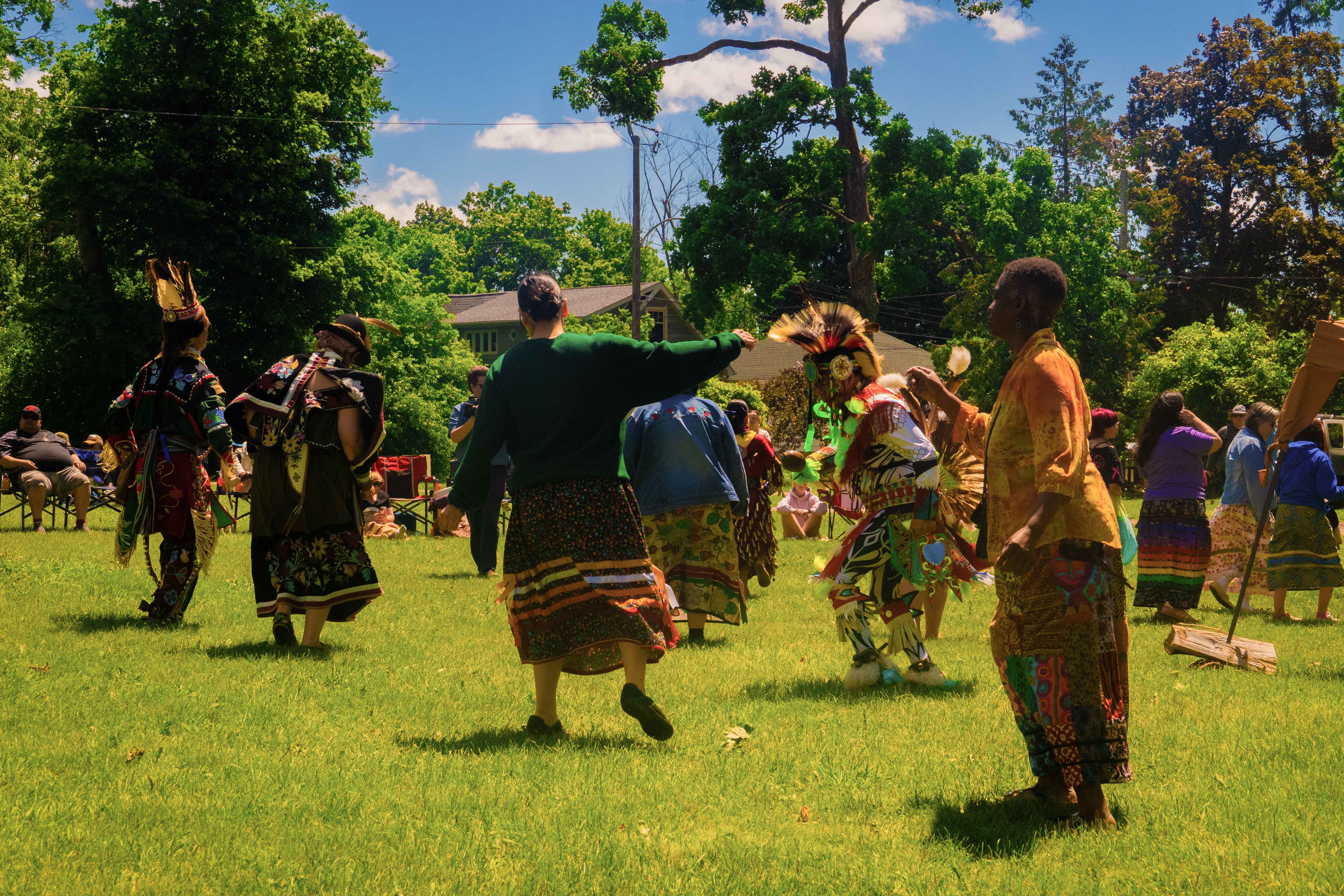
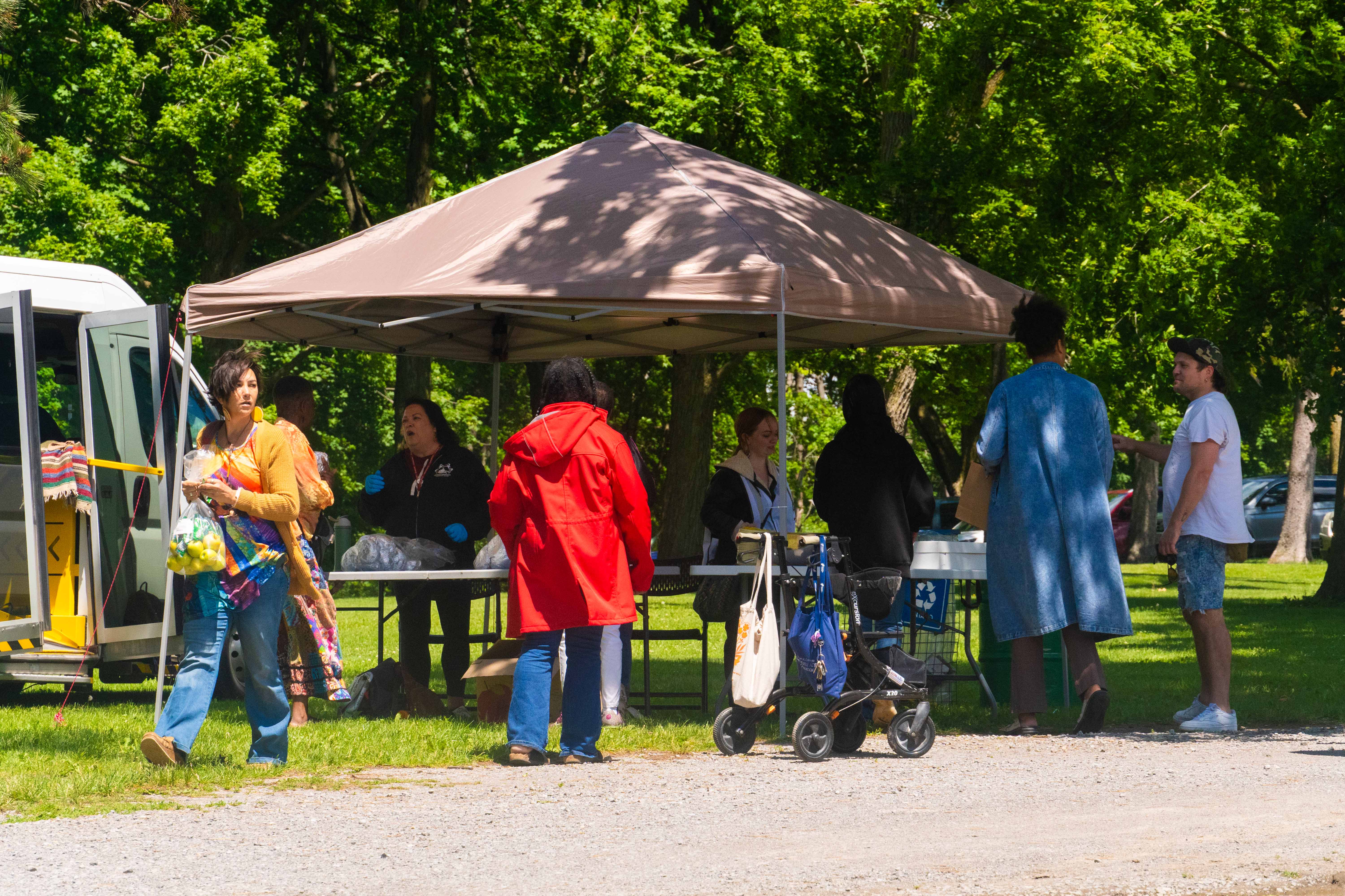
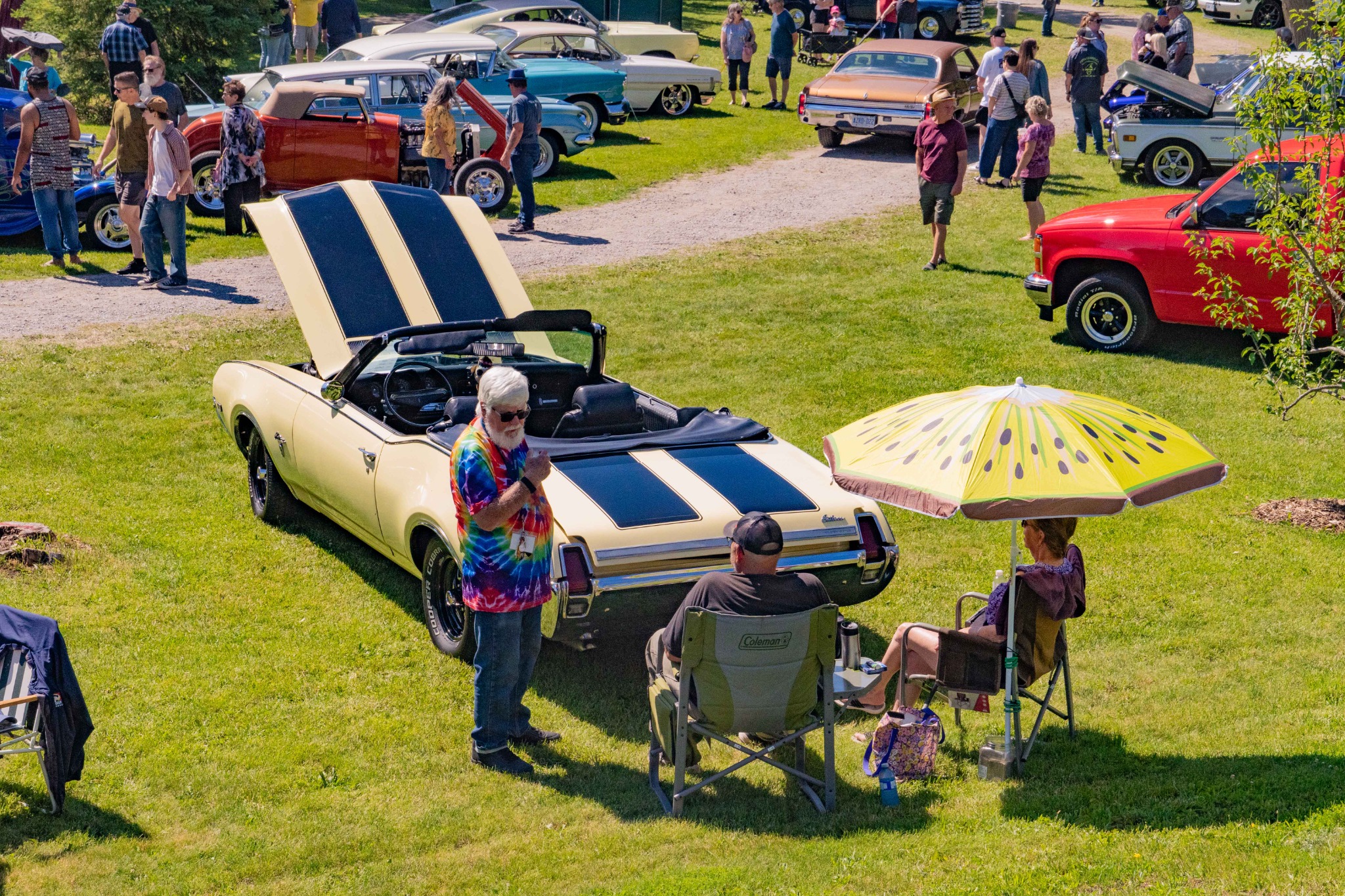
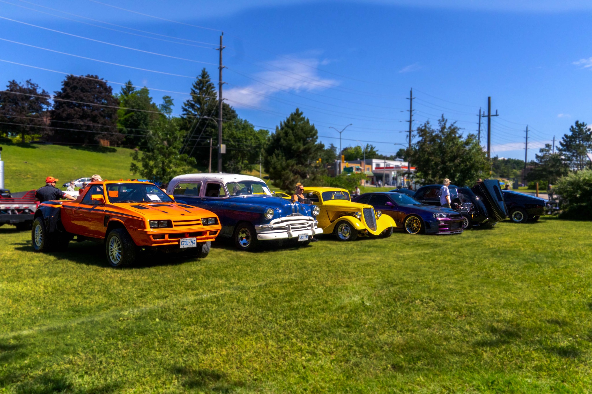
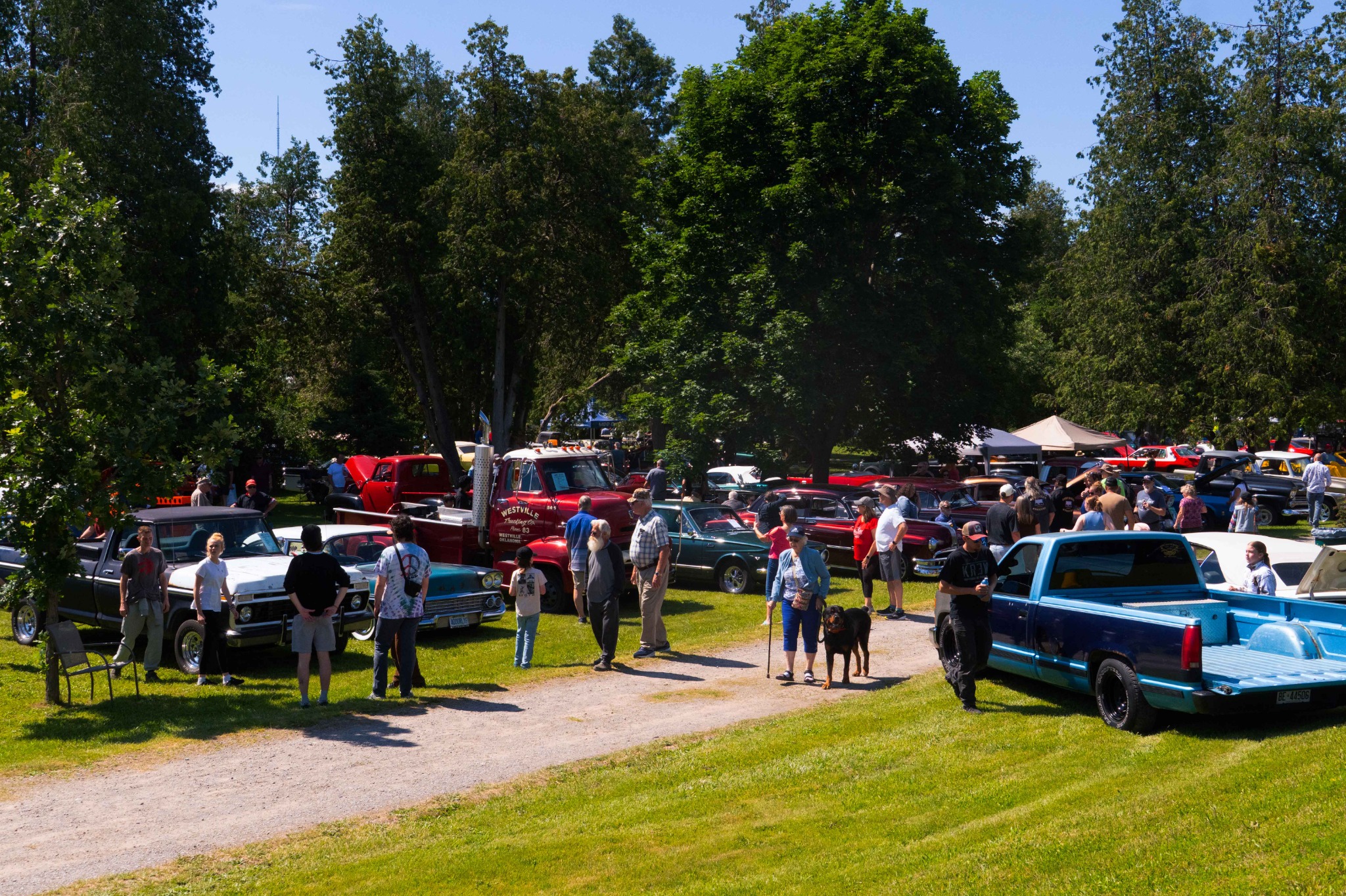
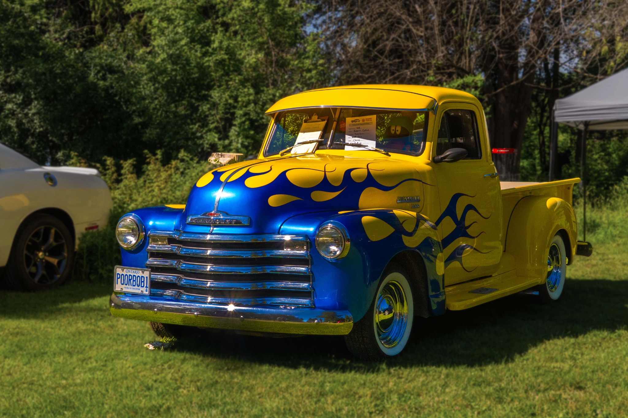
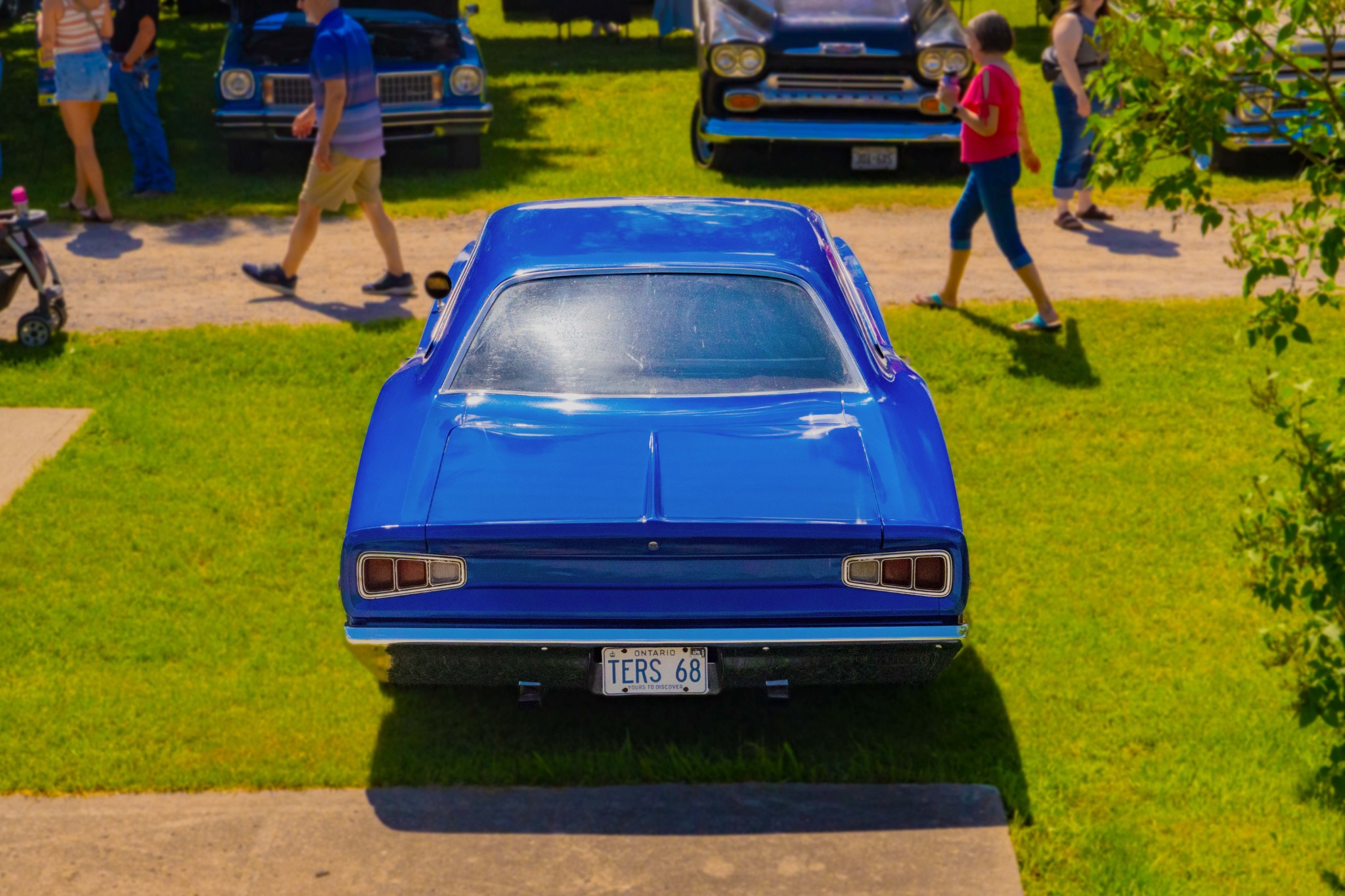
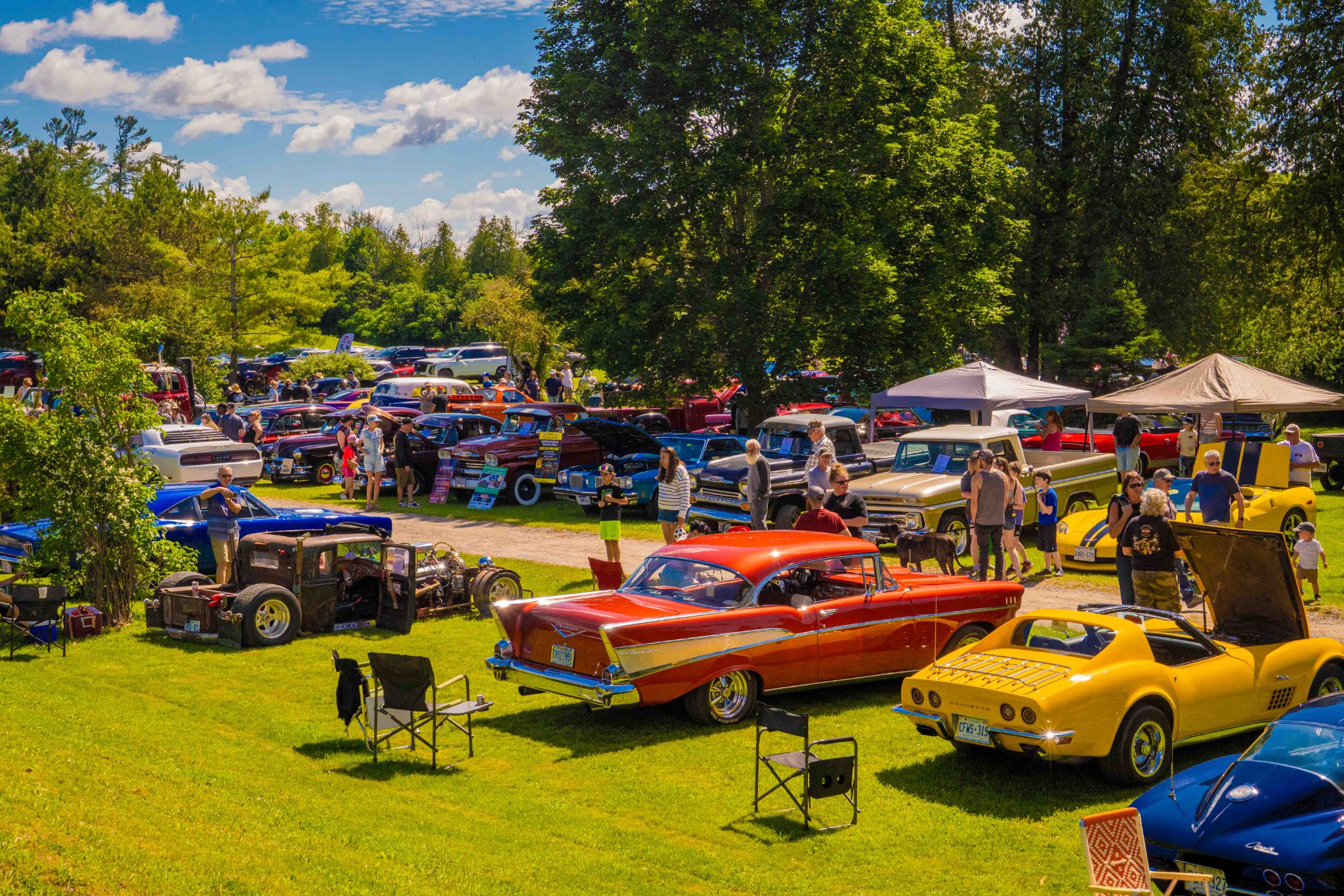
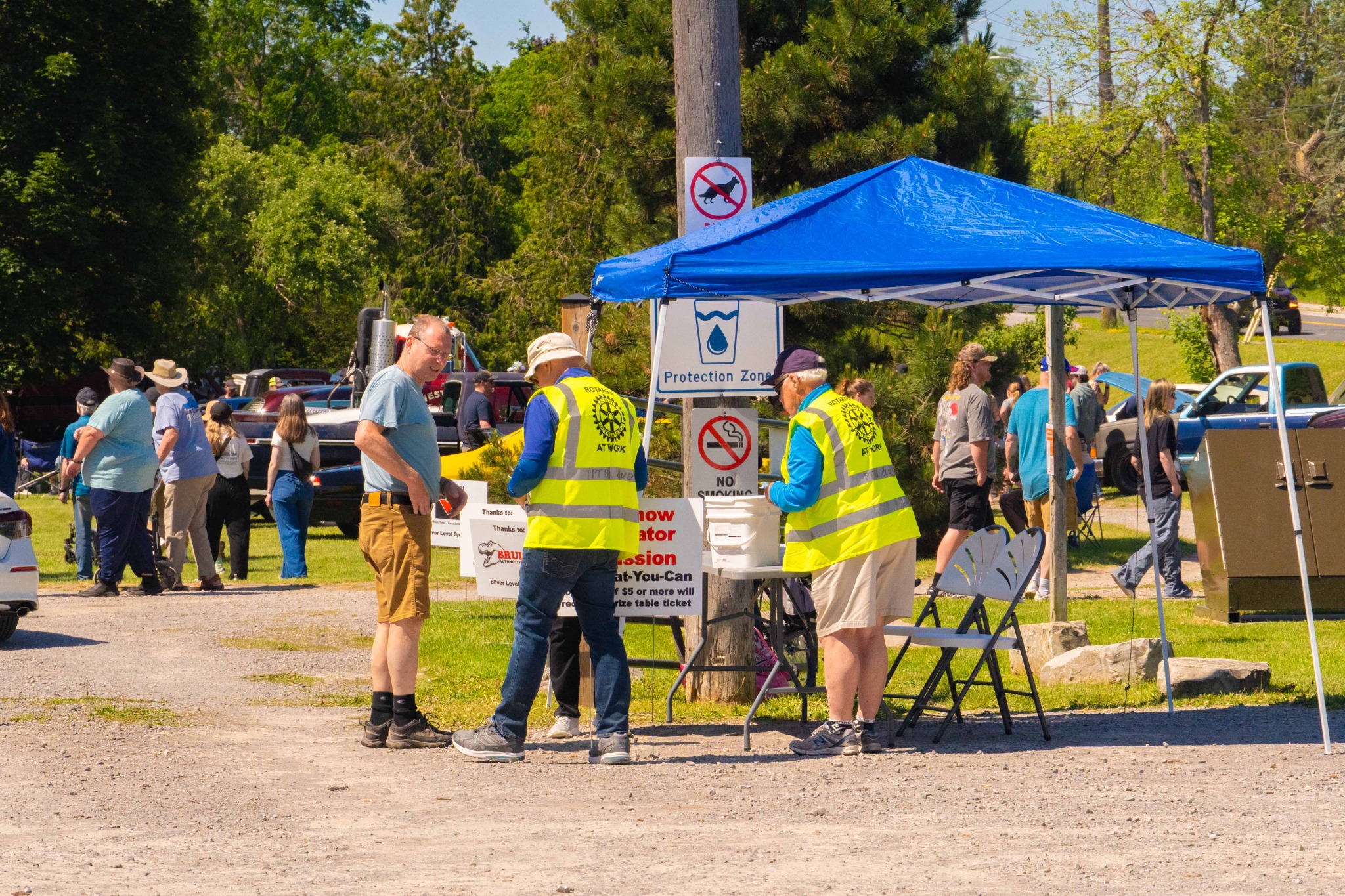
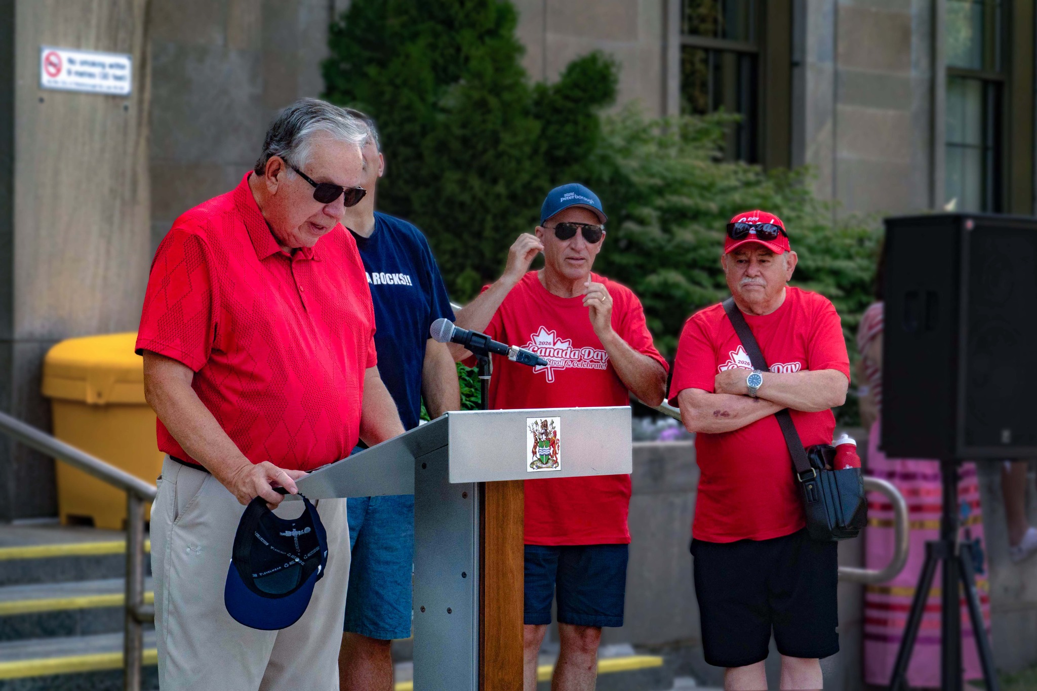
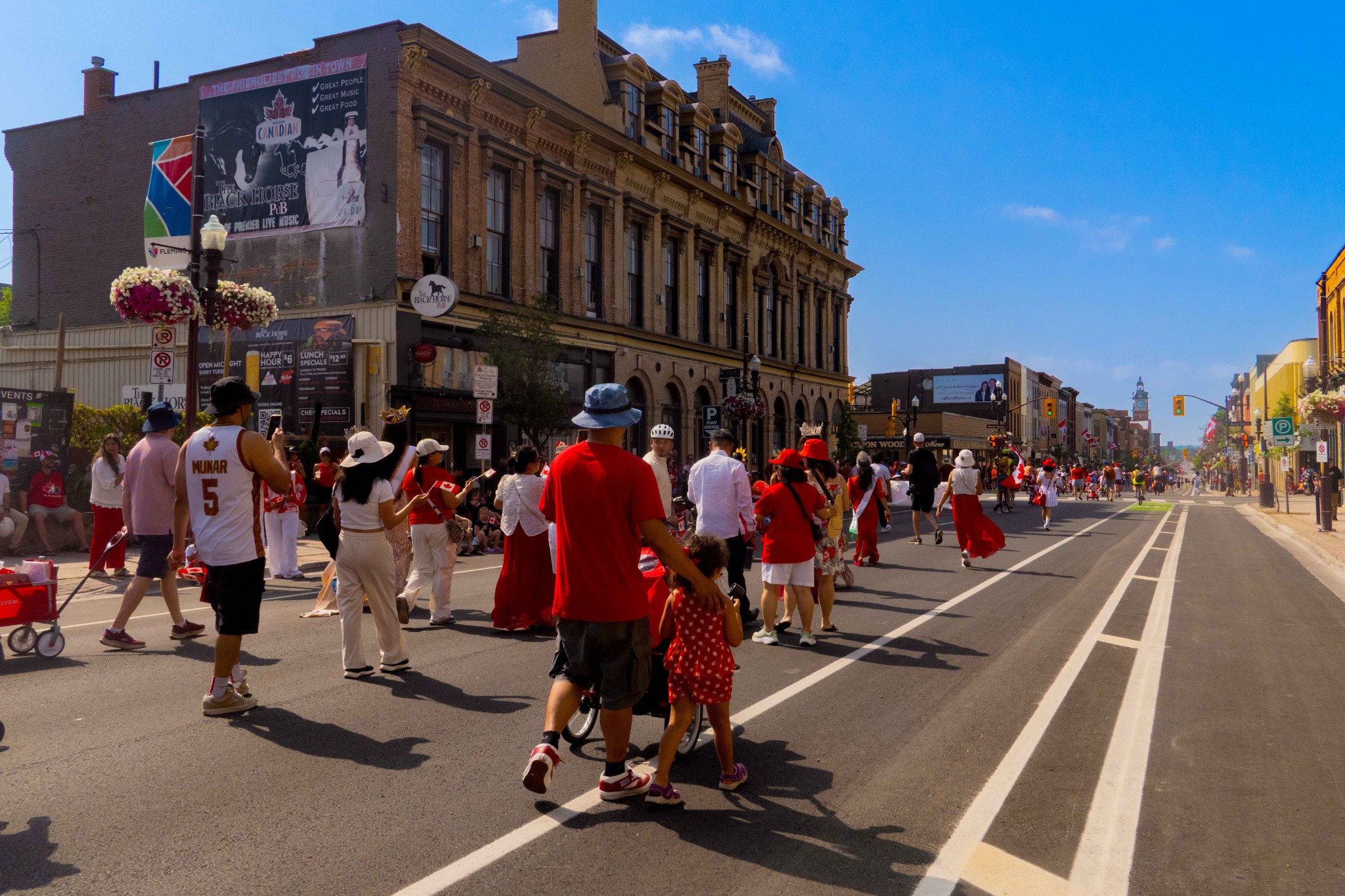
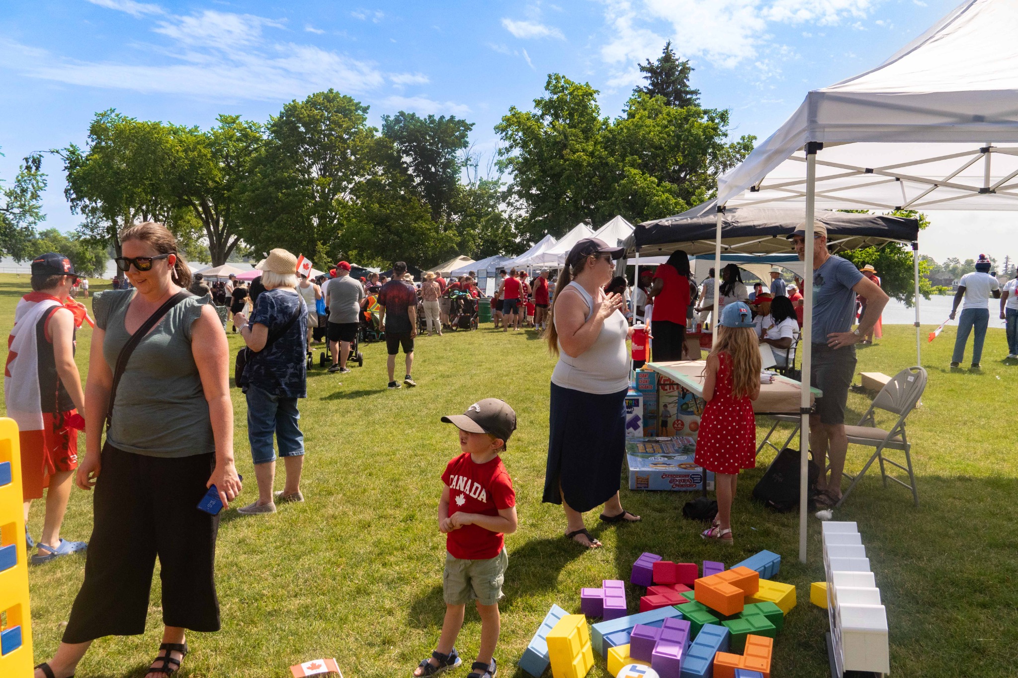
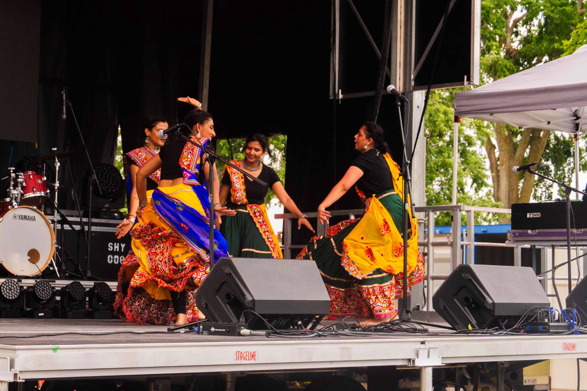
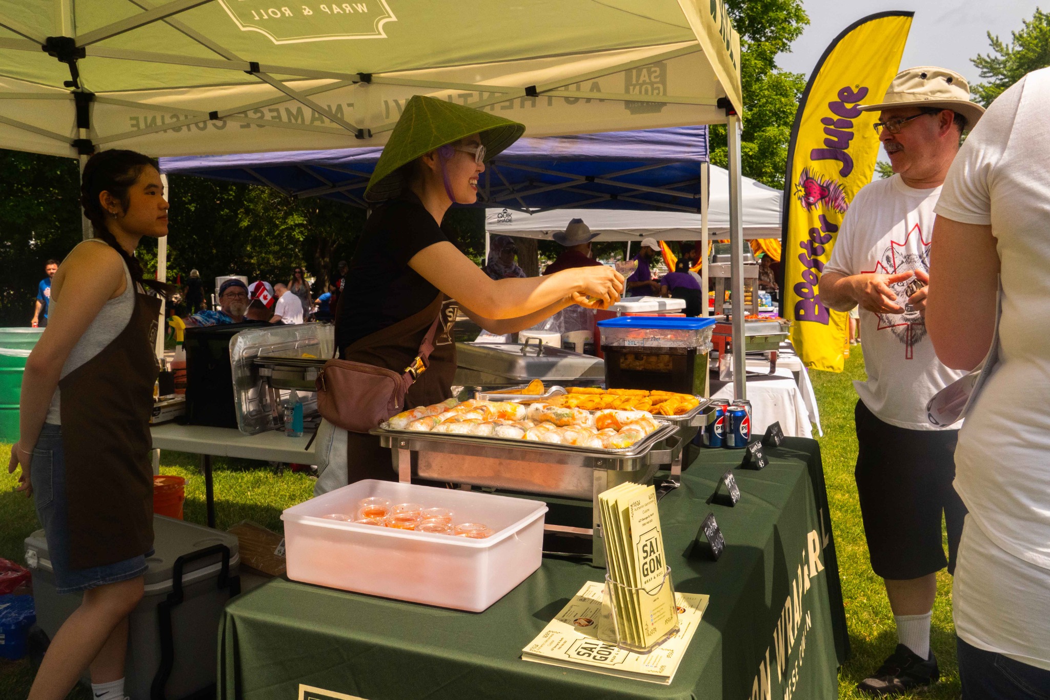
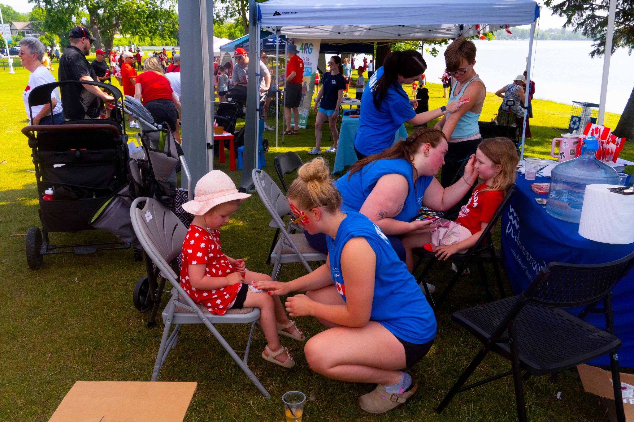
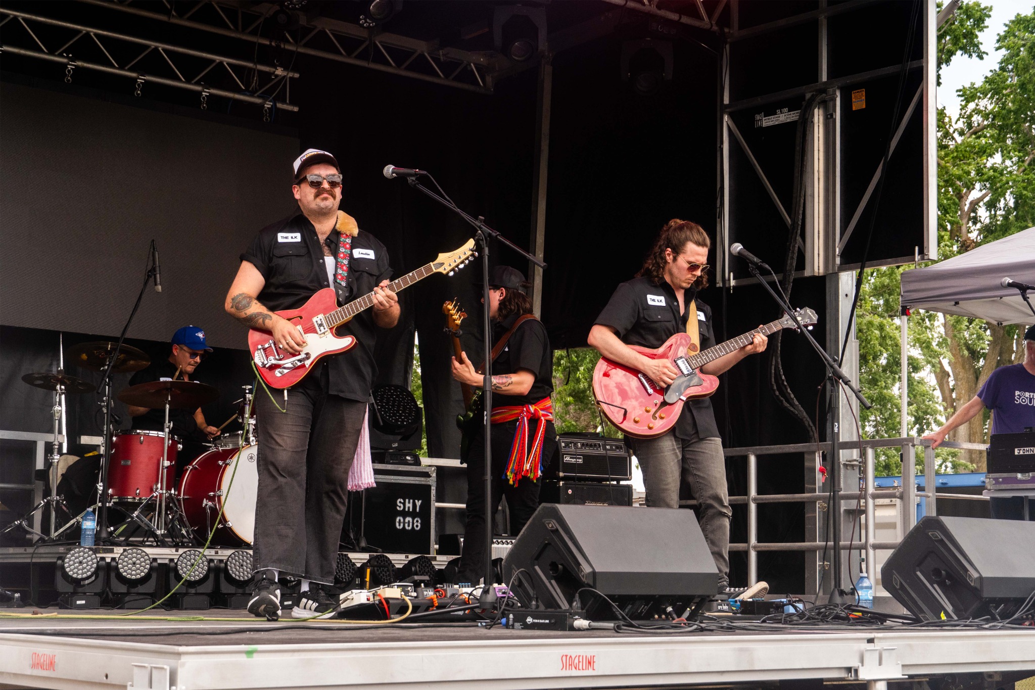
As Cultural Content Creator for the City of Peterborough, I documented a range of community and cultural events through photography and video, capturing performances, celebrations, public gatherings, and candid moments. The work focused on creating engaging visual content that reflects the people, atmosphere, and character of each event.
Events Photography

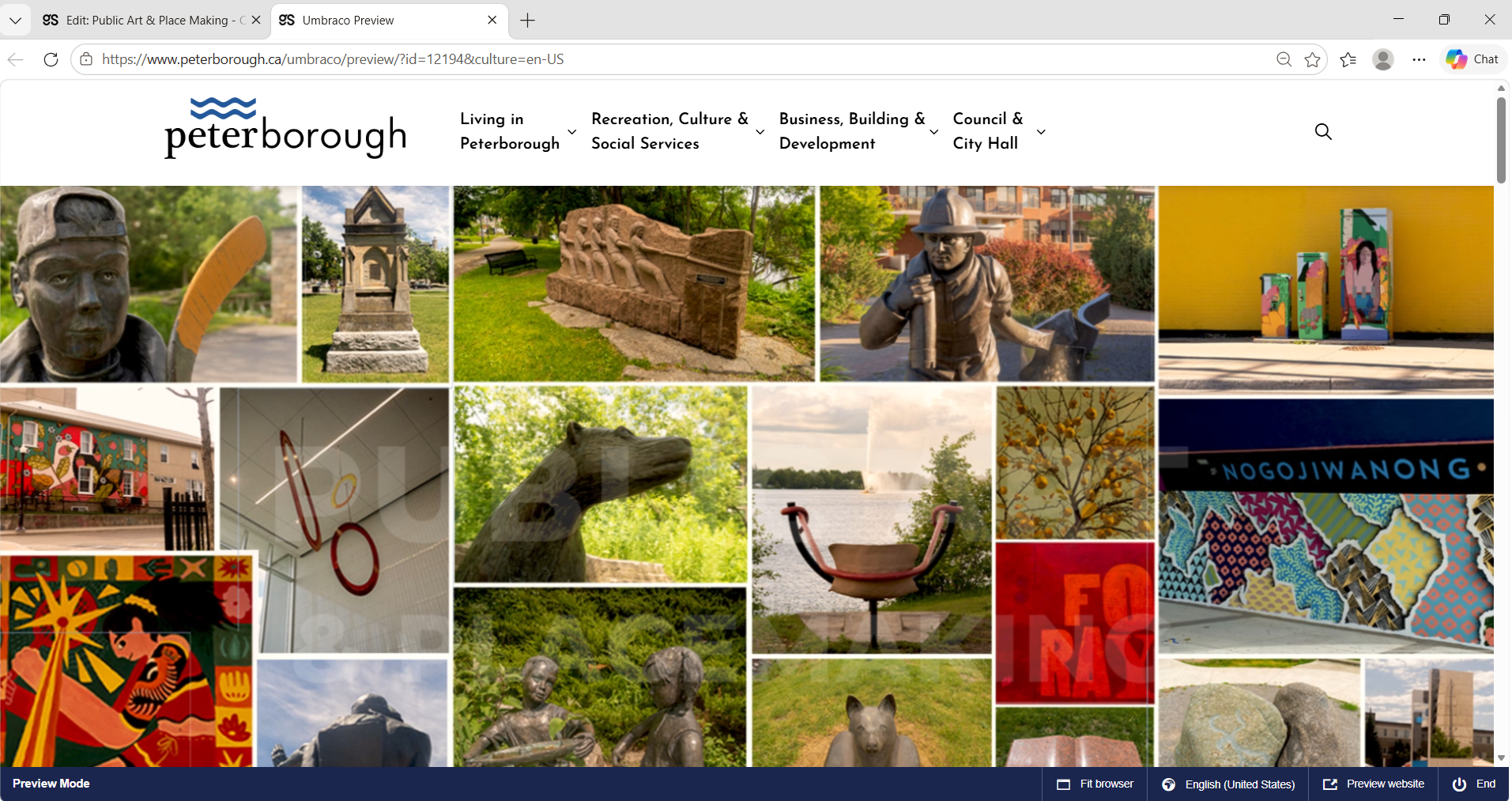
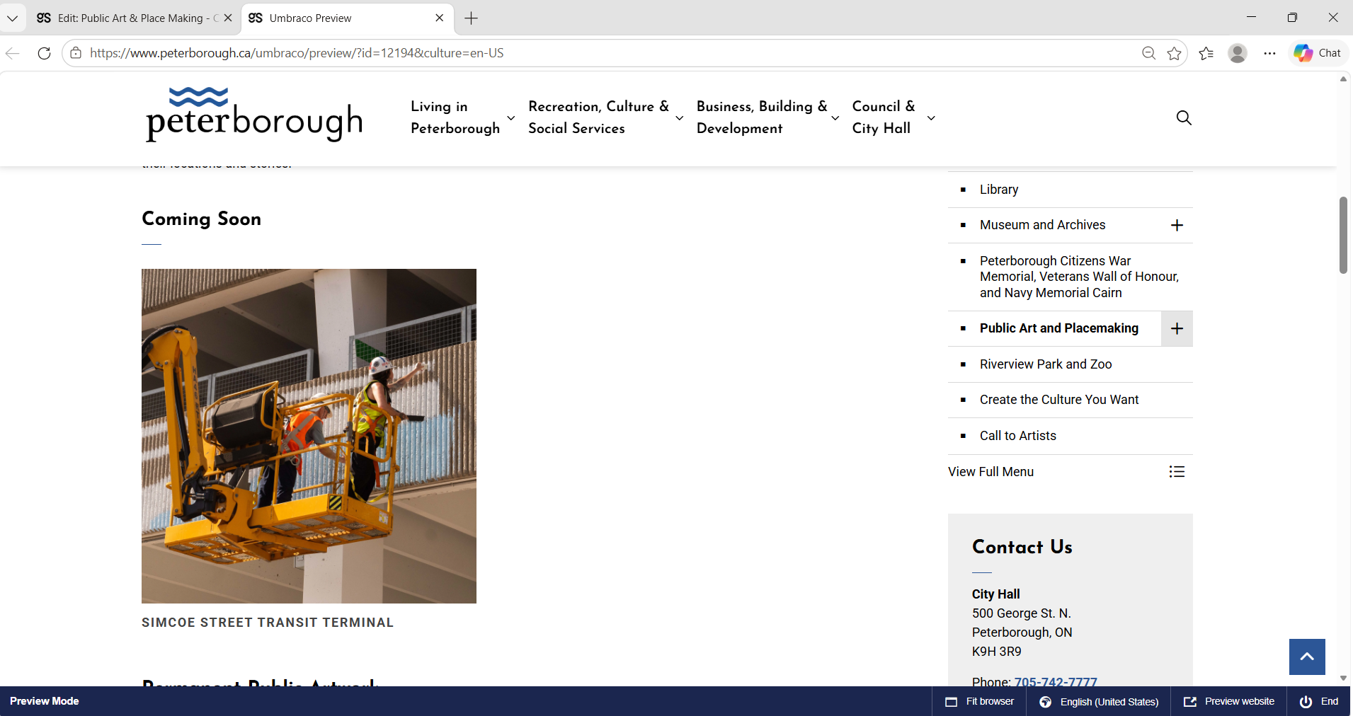
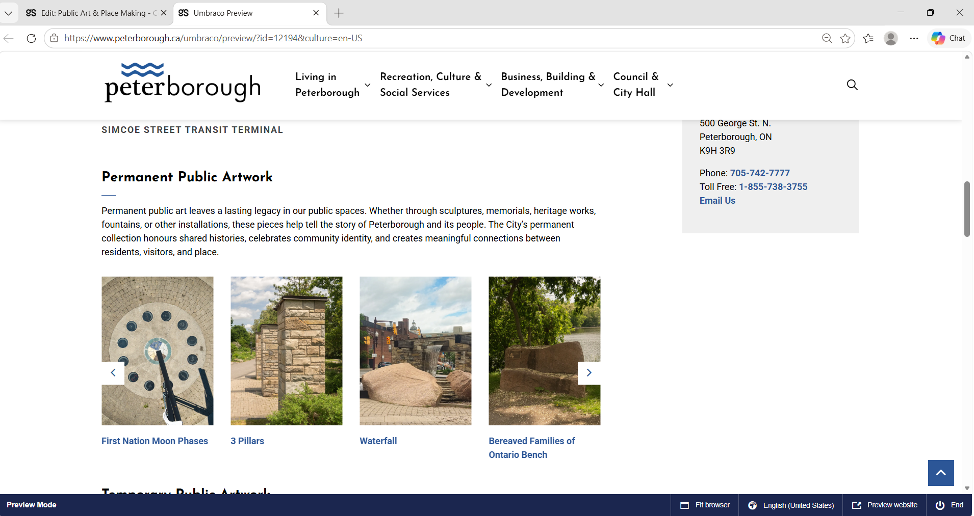
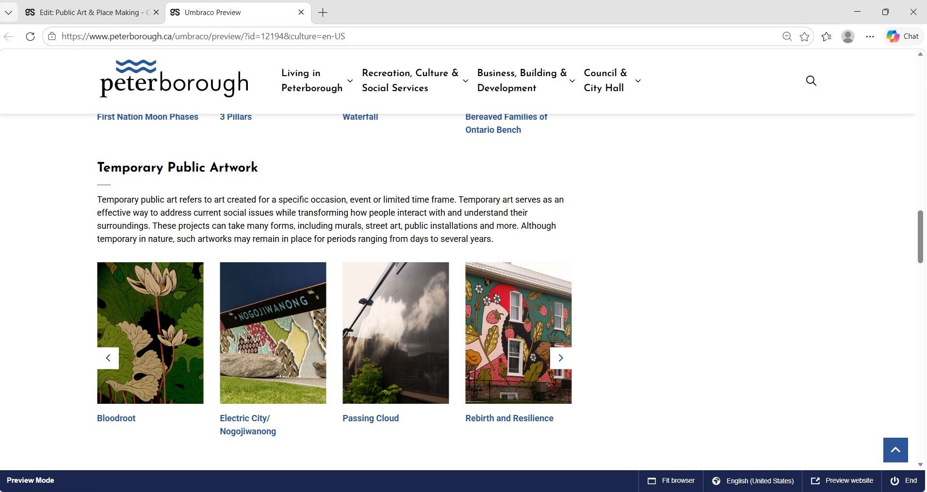
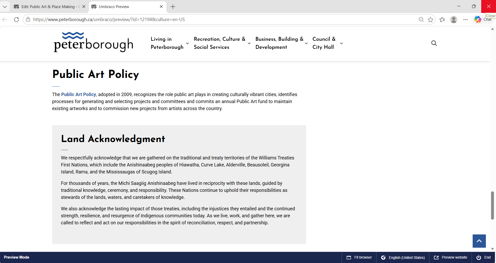
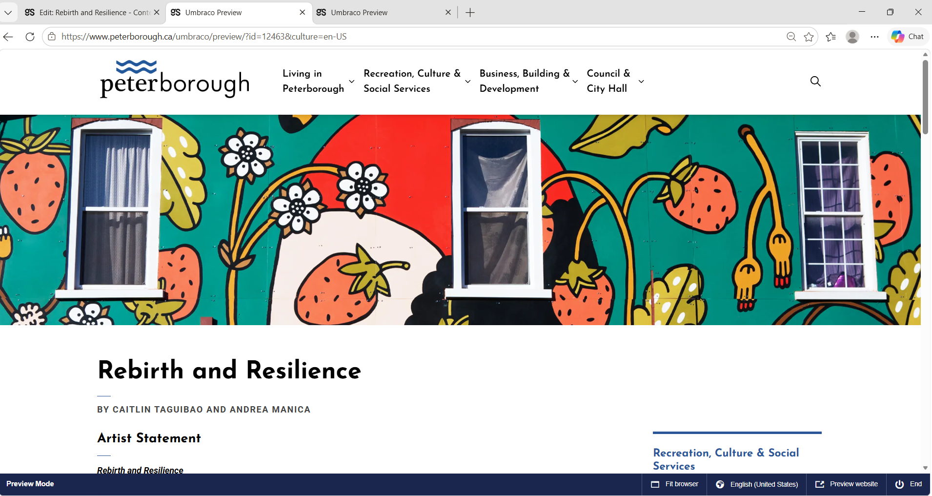
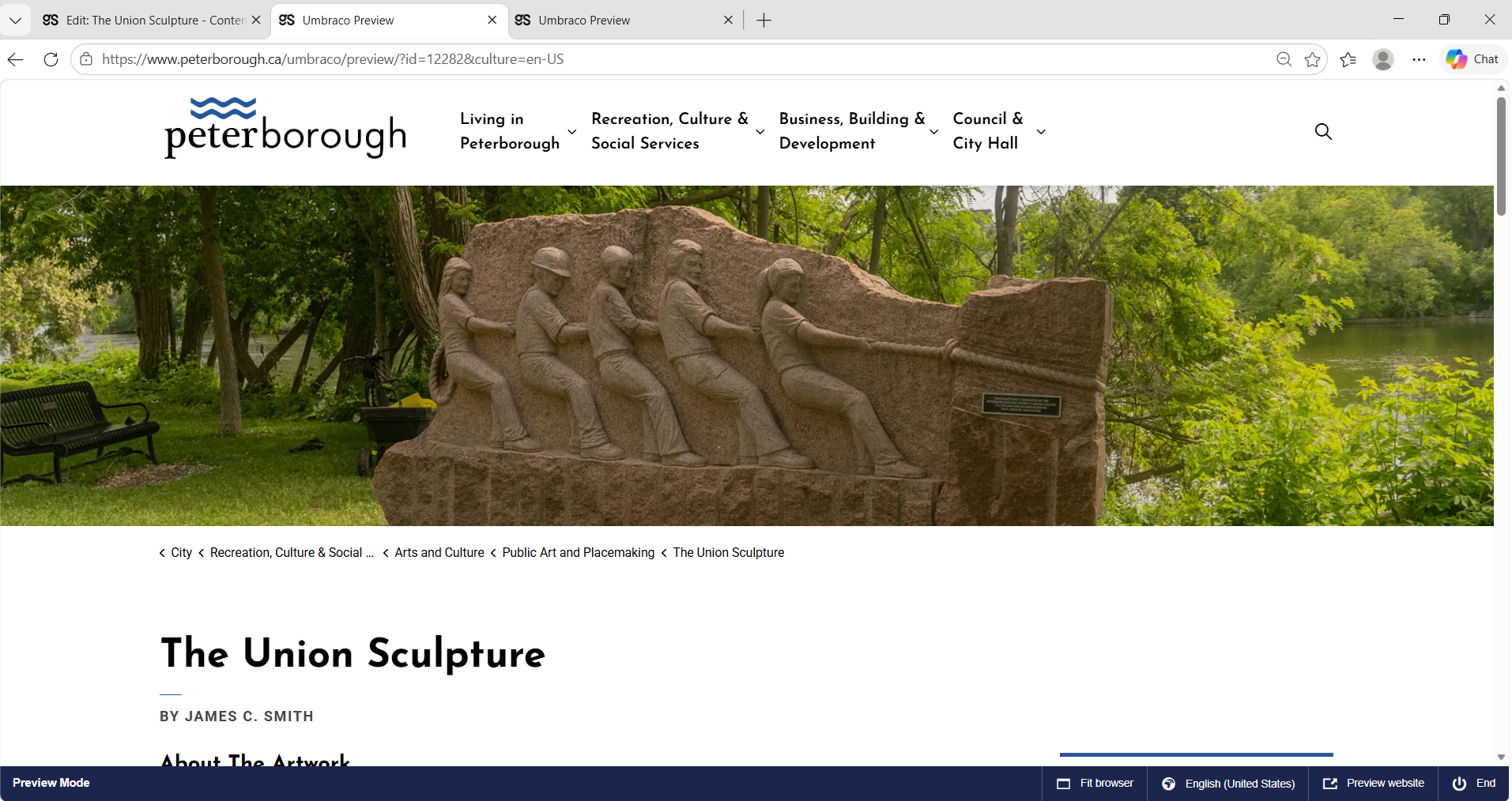
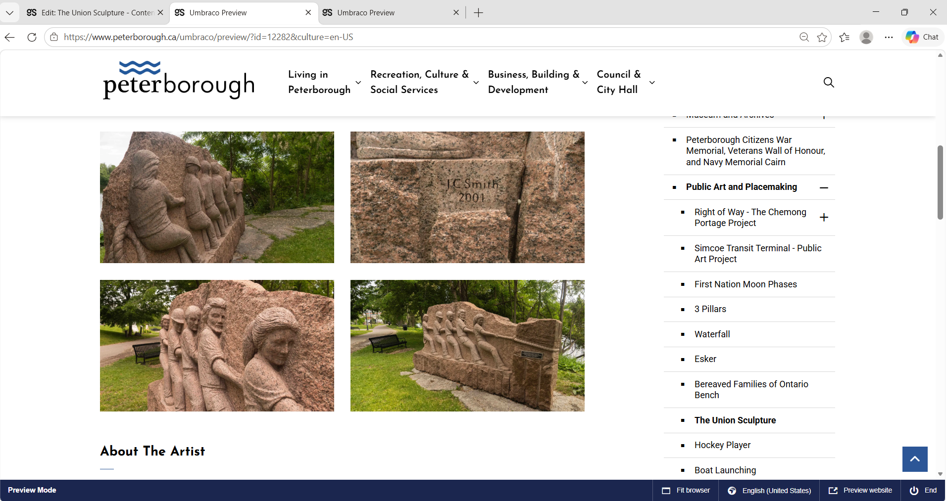
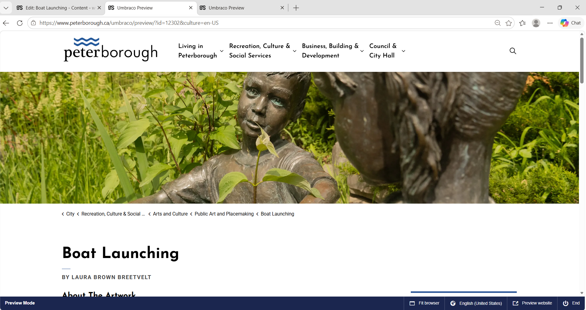
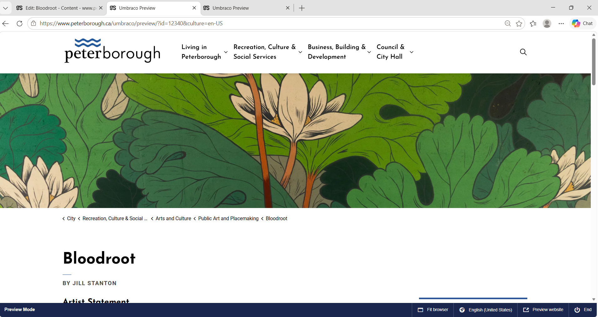
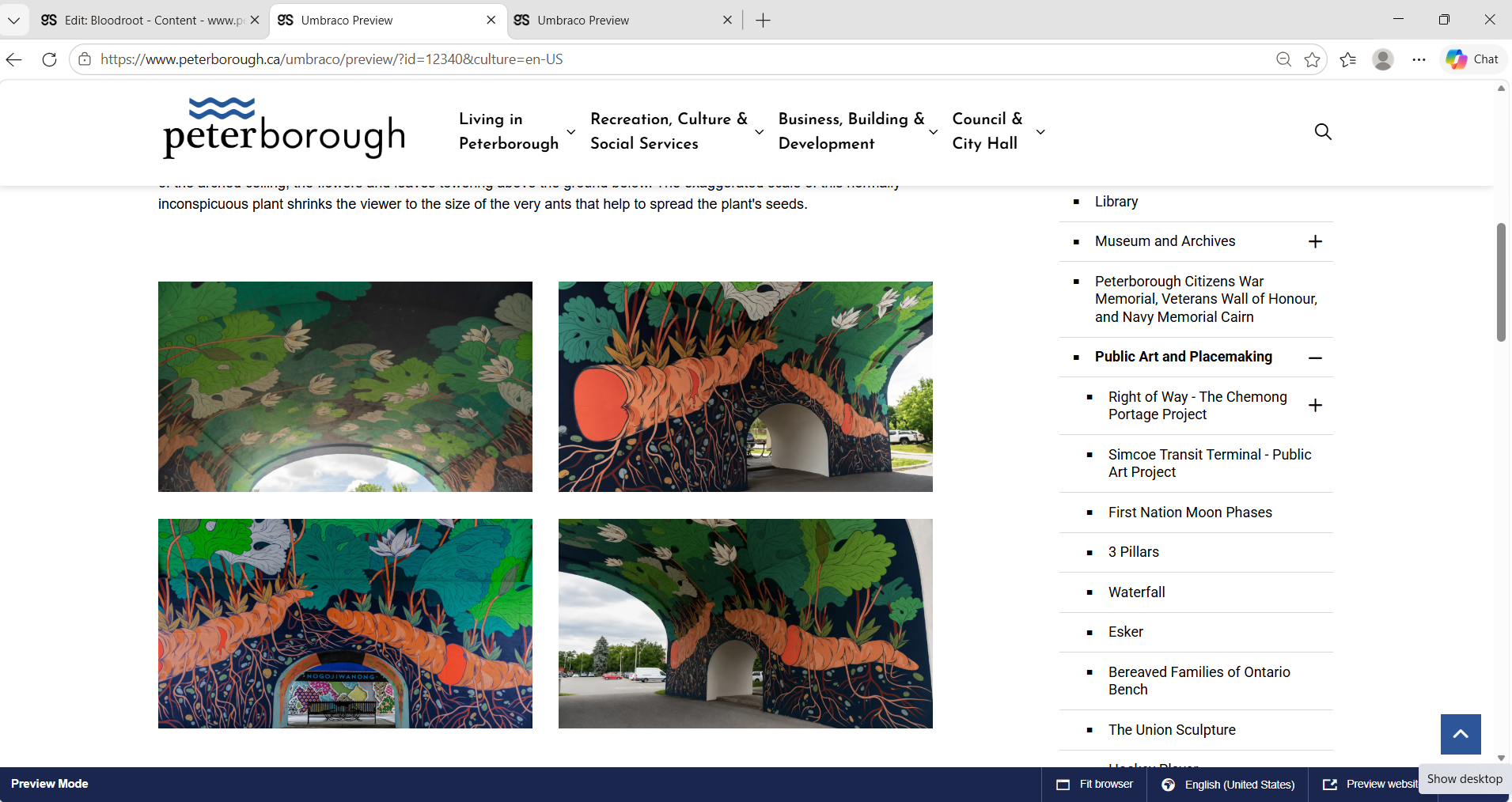
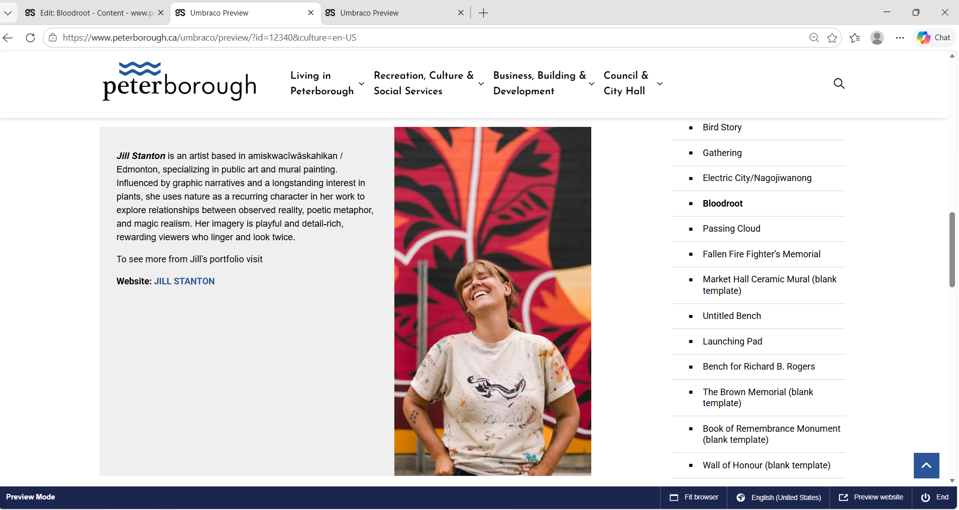
Working within the City of Peterborough’s Govstack CMS and established design system, I structured and organized Public Art & Placemaking content, integrated original photography, and maintained consistency with the City’s accessibility and web standards.

DIGITAL EXPERIENCE / GOVSTACK

A short visual journey documenting public artworks across Peterborough, Ontario. I approached the film as a visual system rather than a collection of cinematic shots using location, artwork details, typography, and aerial footage to guide viewers through the city while keeping the art itself at the centre of the story.

Role: Cinematography · Drone Photography · Video Editing · Colour · Motion & Typography

Public Art Peterborough

City of Kawartha Lakes — Drone Film & Logo Animation (internship)

Cinematic drone video editing for Kawartha Lakes, emphasizing natural environment and spatial storytelling.

Logo animation designed to unify brand presence across digital assets.

Footage sourced from Morning Cup Production

AUTUMN
  • Created during my internship with the City of Kawartha Lakes to promote the region as a filming destination for filmmakers and TV production companies.
  • Combined drone footage with cinematic close-up shots to create a more immersive and emotional viewing experience.
  • Used visual storytelling techniques and shot sequencing to connect different locations and create the feeling of a journey through Kawartha Lakes during the fall season.
SPRING / SUMMER
  • Created during my internship with the City of Kawartha Lakes to showcase the region during the spring season and encourage film production activity in the area.
  • Focused primarily on drone cinematography to highlight the natural landscapes, atmosphere, and seasonal transformation of Kawartha Lakes.
  • Edited and structured the reel to create a calm and visually engaging flow inspired by tourism and cinematic promotional content.

City of Peterborough — logo animation & Visual Documentation (Aerial)

Aerial footage capturing Peterborough’s natural and urban landscape. Focused on composition, movement, and natural light to create a calm, observational tone.

Shot and edited by Malek Khaito using DJI Mini 5 Pro drone

Peterborough downtown / Little Lake / Lansdowne / Fleming College / Trent University
  • Edited and color graded drone footage with subtle urban ambience for web presentation.
  • Integrated ambient downtown audio to reinforce atmosphere and pacing.
  • Combined aerial cinematography, color grading, and environmental sound design for portfolio presentation.


Music: This Nature Music by Right_Time_Music

Peterborough downtown / Chemong Road / Liftlock
  • Edited and color graded drone footage with subtle urban ambience for web presentation.
  • Integrated ambient downtown audio to reinforce atmosphere and pacing.
  • Combined aerial cinematography, color grading, and environmental sound design for portfolio presentation.

Music: Autumn Leaves by Eisuka Mochizuki

New Stages Theatre — Production support & Layout Exploration (volunteer)

Ongoing volunteer production design support for a local theatre organization, including print-ready posters, digital campaigns, motion assets, and social media content developed within an established visual system.

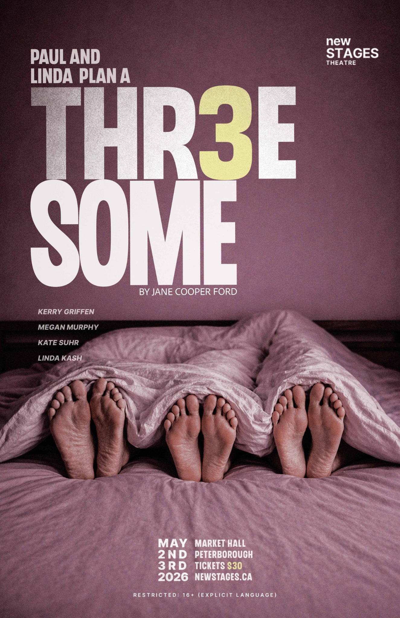
Final concept poster (independent direction)

A concept-driven theatre poster using minimal imagery and strong typography to communicate narrative. The photograph establishes tone, while bold, condensed type drives hierarchy and impact. A subtle “3” introduces controlled disruption within the system, while the layout balances negative space with density to maintain clarity.

Production Work

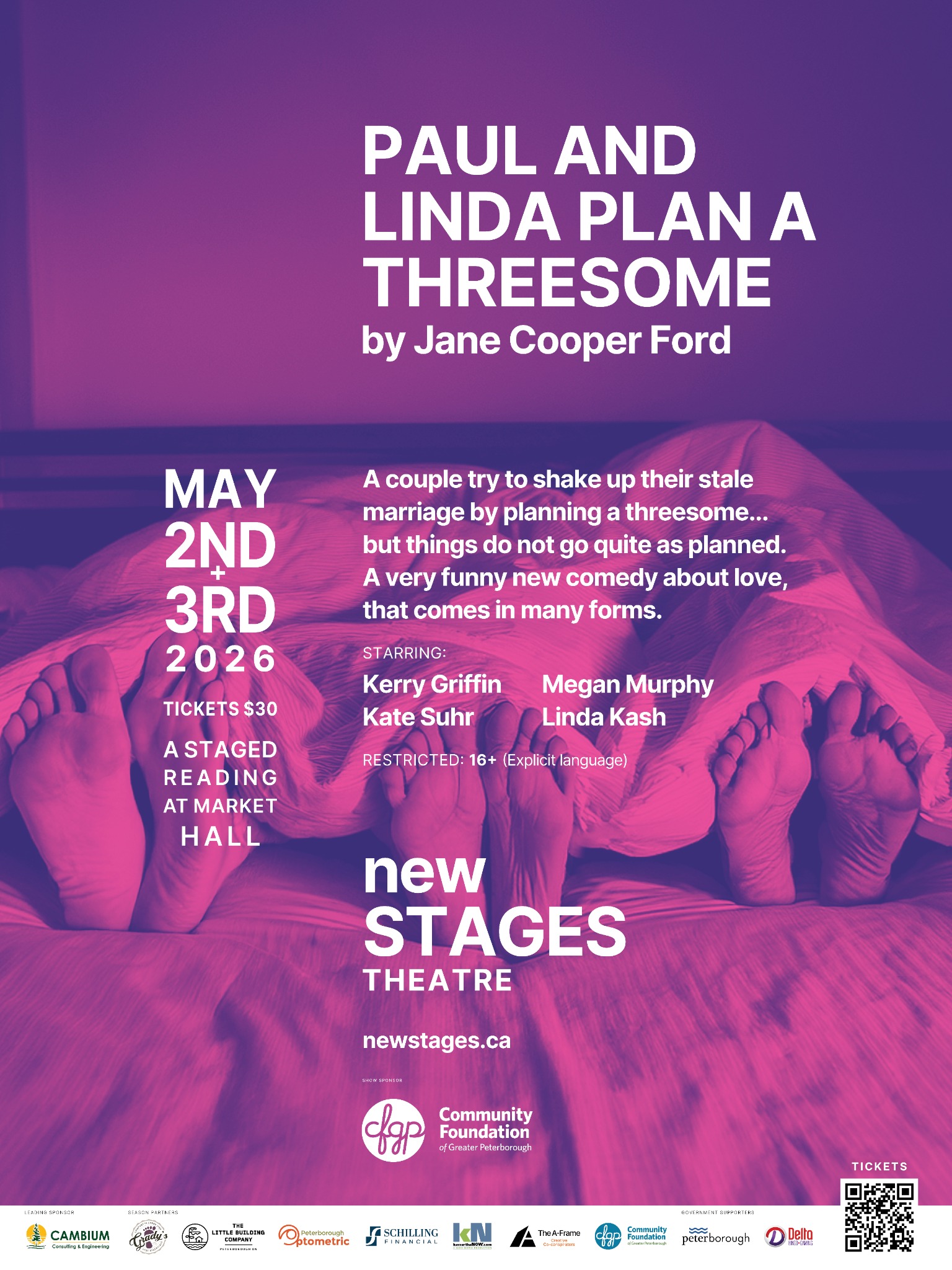
Reference Layout — 36×48 Poster (Print)

Paul and Linda Plan a Threesome

Reference poster used to establish the typography, layout structure, spacing, and overall visual system for the theatre campaign.

Clyde’s Layout — 36×48 Poster (Print)

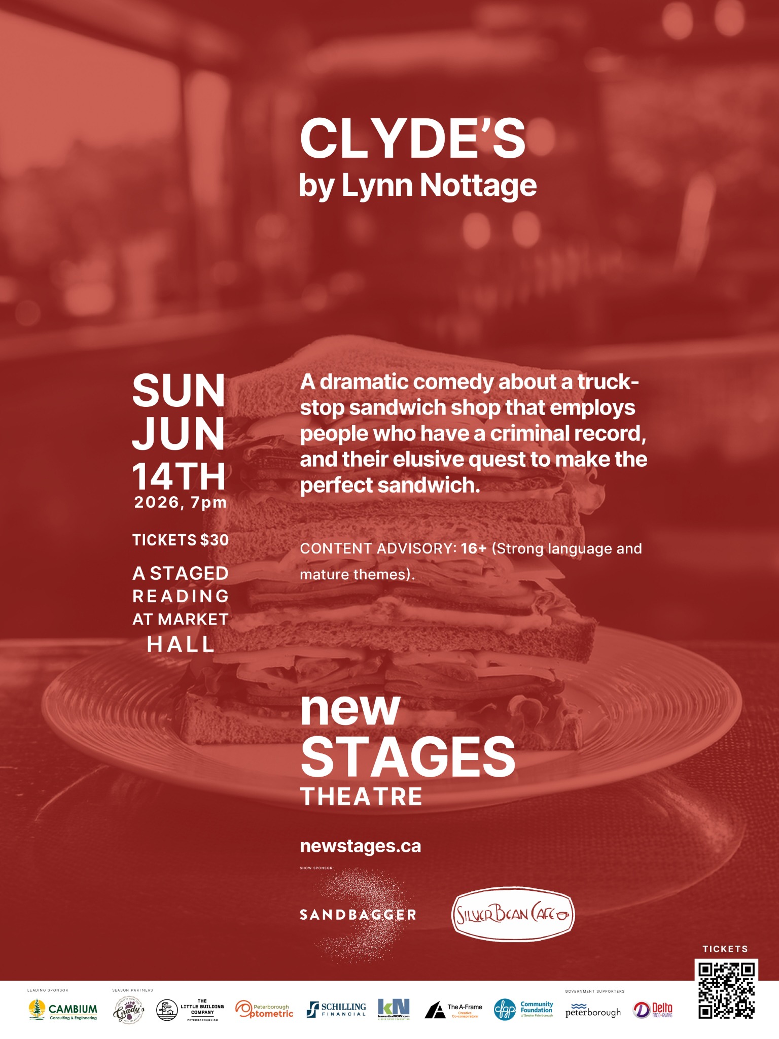
Clyde’s

Designed to match the established visual system of the previous production while adapting a completely different subject and image into the same campaign structure. The starring list was intentionally removed by the lead designer to create a cleaner and more minimal version of the campaign. Crop marks were also removed for presentation exports such as JPEGs and interactive PDFs to preserve cleaner color presentation and viewing quality.

Reference Layout — 11×17 Poster (Print)
Clyde’s Layout — 11×17 Poster (Print)
Kawarthanow_Gif

poster Adaptation — Digital Formats

Facebook Post — Feed Format (4:5) Adjusted composition to maintain readability within a slightly taller frame.

Instagram Post — Feed Format (4:5) Balanced layout to retain hierarchy within a square format.

Instagram Story — Vertical Format (9:16) Repositioned key elements to support top-down viewing and immediate engagement in a full-screen format.

Facebook Cover- wide-format 820px*360px

Webpage Hero – wide-format (16:9)

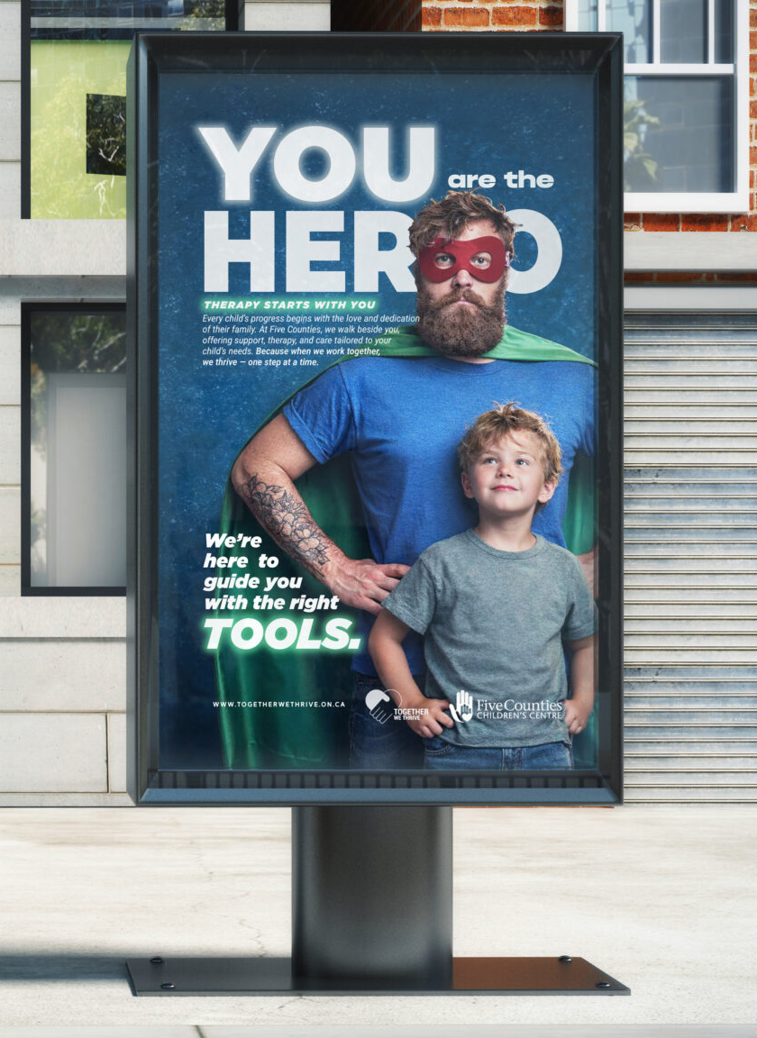
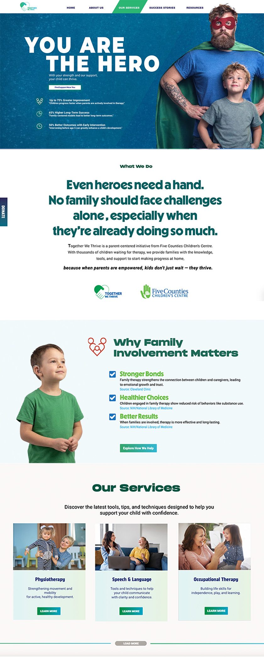
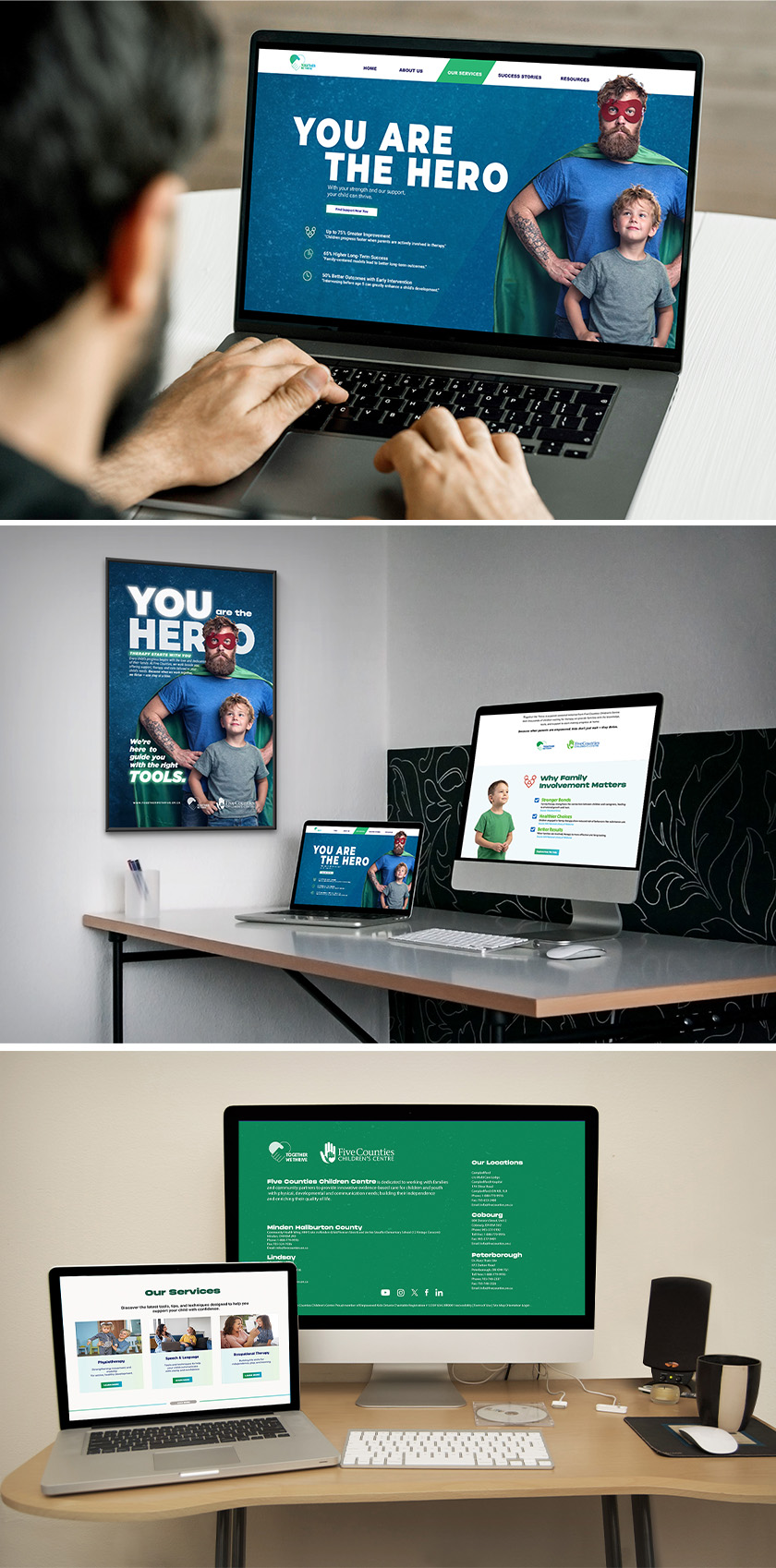
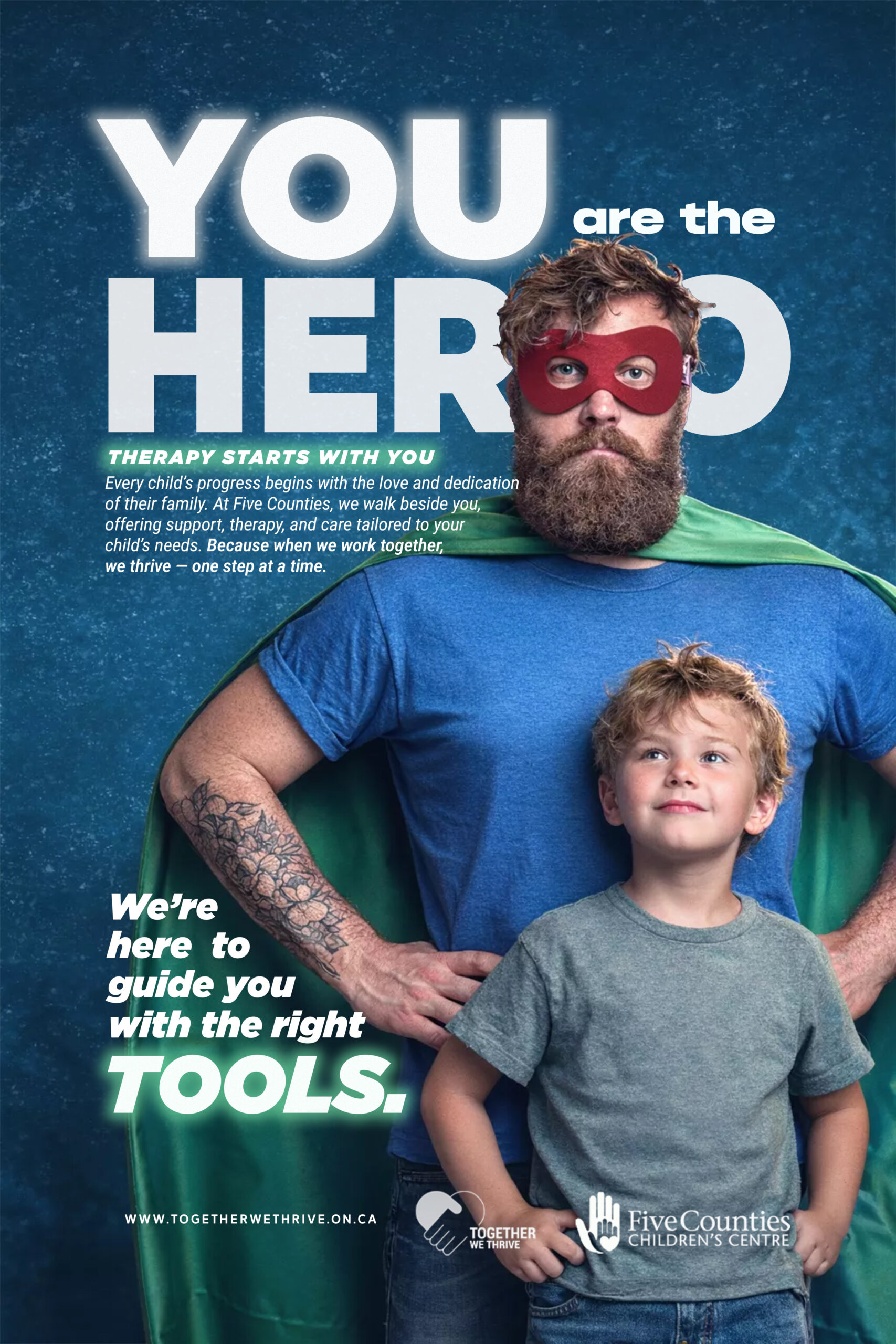
Campaign concept – Five counties children centre

together we thrive

This campaign reframes the common “child hero” narrative often used in healthcare campaigns. Instead, the concept positions parents and caregivers as the real heroes behind a child’s progress. Using a superhero metaphor, the visuals highlight the strength and dedication families bring to the therapy journey.

color palette

#216B9B

Primary color

Builds trust and calm. Connects to healthcare + reliability. Used as the main background to keep the message stable and reassuring.

#47B492

Support color

Represents growth and progress. Ties directly to child development and therapy outcomes. Used for highlights and supportive messaging.

#FFFFFE

Base / neutral

Keeps everything clean and accessible. Improves readability and clarity. Balances the stronger colors

#8C2137

Accent color

Adds energy and urgency. Used sparingly to draw attention (e.g. mask, key elements). Connects to the “hero” concept without overpowering the tone.

Campaign identity and applications across outdoor, web, and digital platforms.

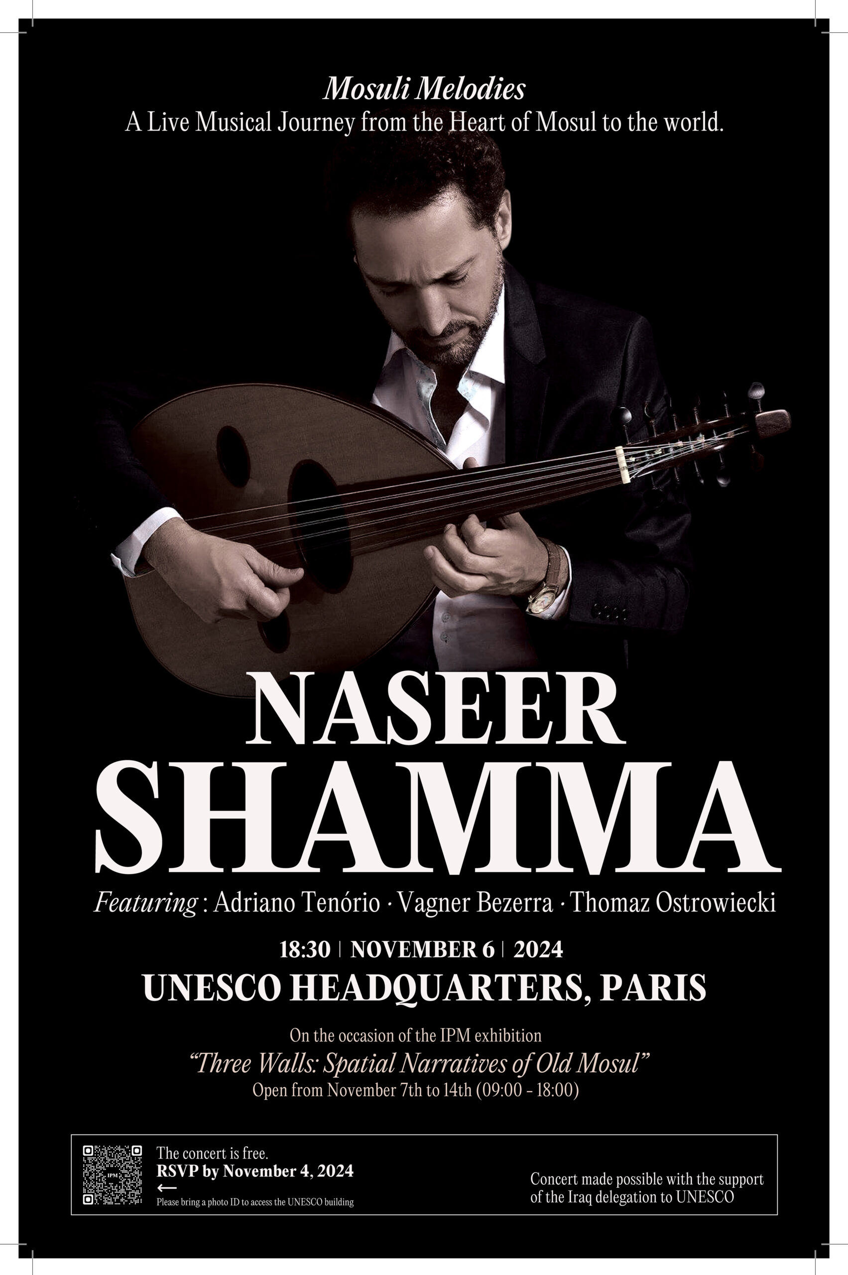
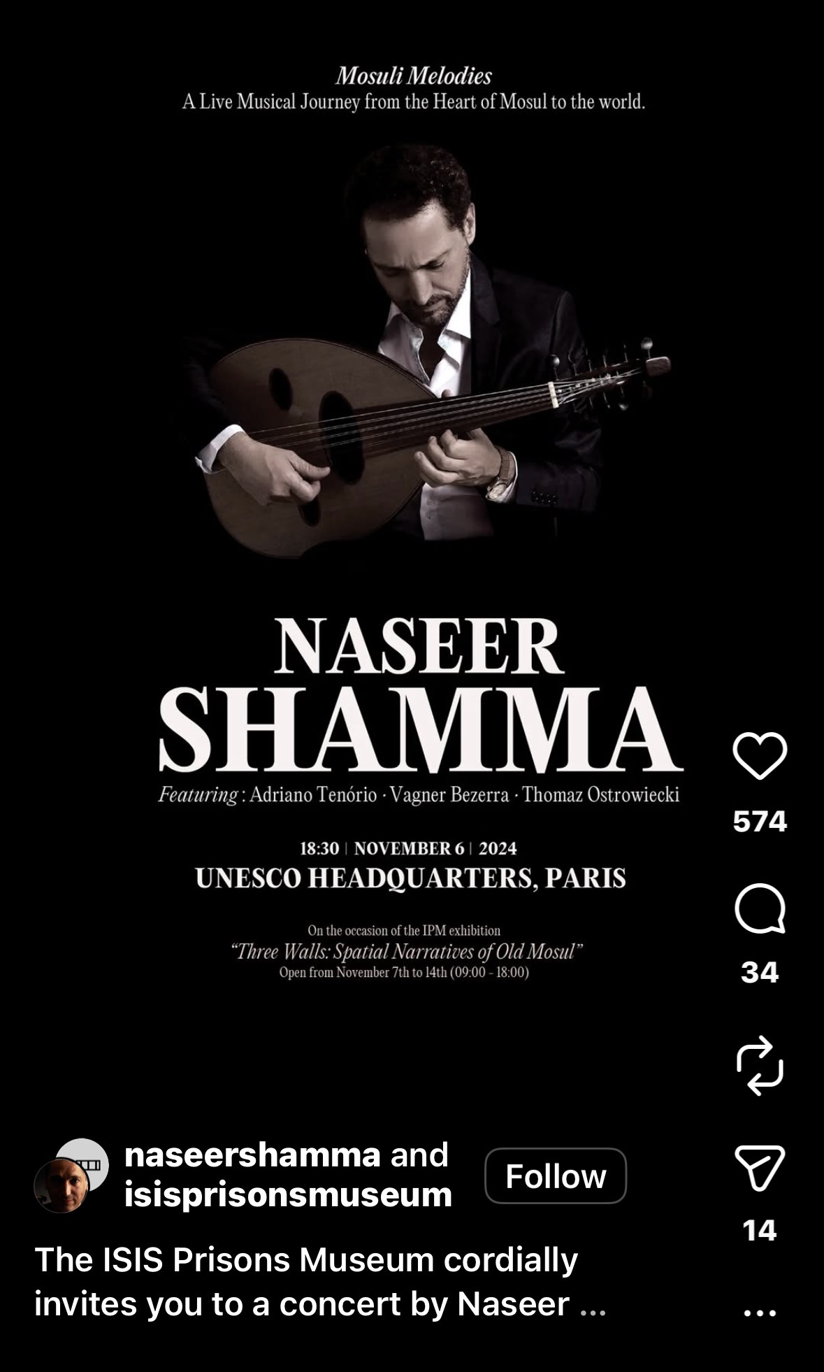
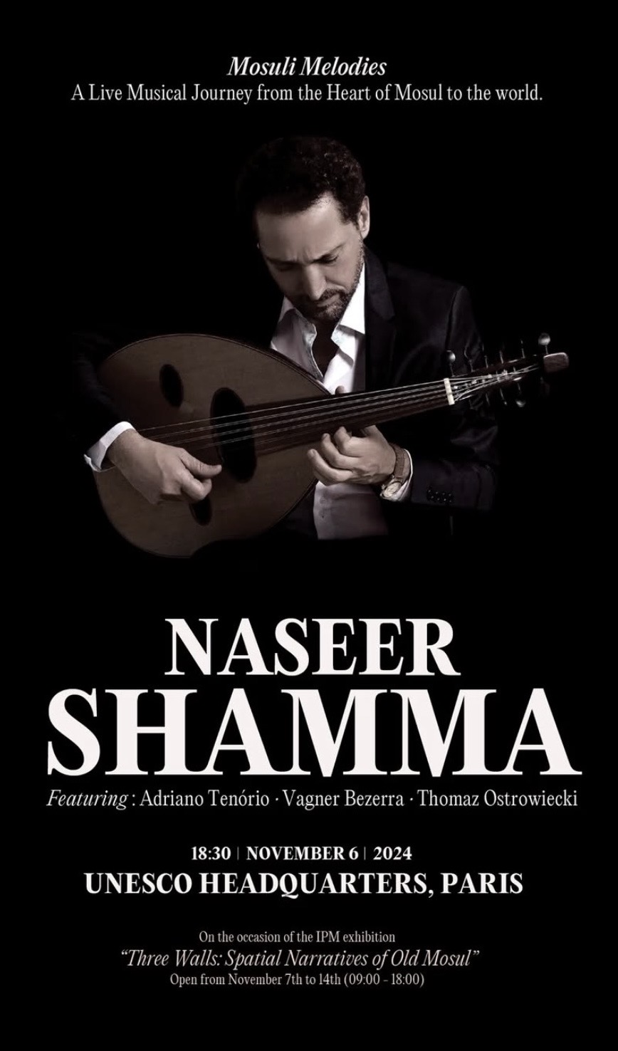
nasser shamma – concert poster – Layout — 11×17 Poster (Print) & Instagram post

isis prisons musum concert

Layout — 11×17 Poster (Print)

This poster was created for a commemorative concert by Naseer Shamma honoring the cultural memory of Mosul after the destruction of ISIS prisons.
The design uses restraint, contrast, and quiet typography to reflect mourning, resilience, and the enduring presence of music as a form of remembrance..

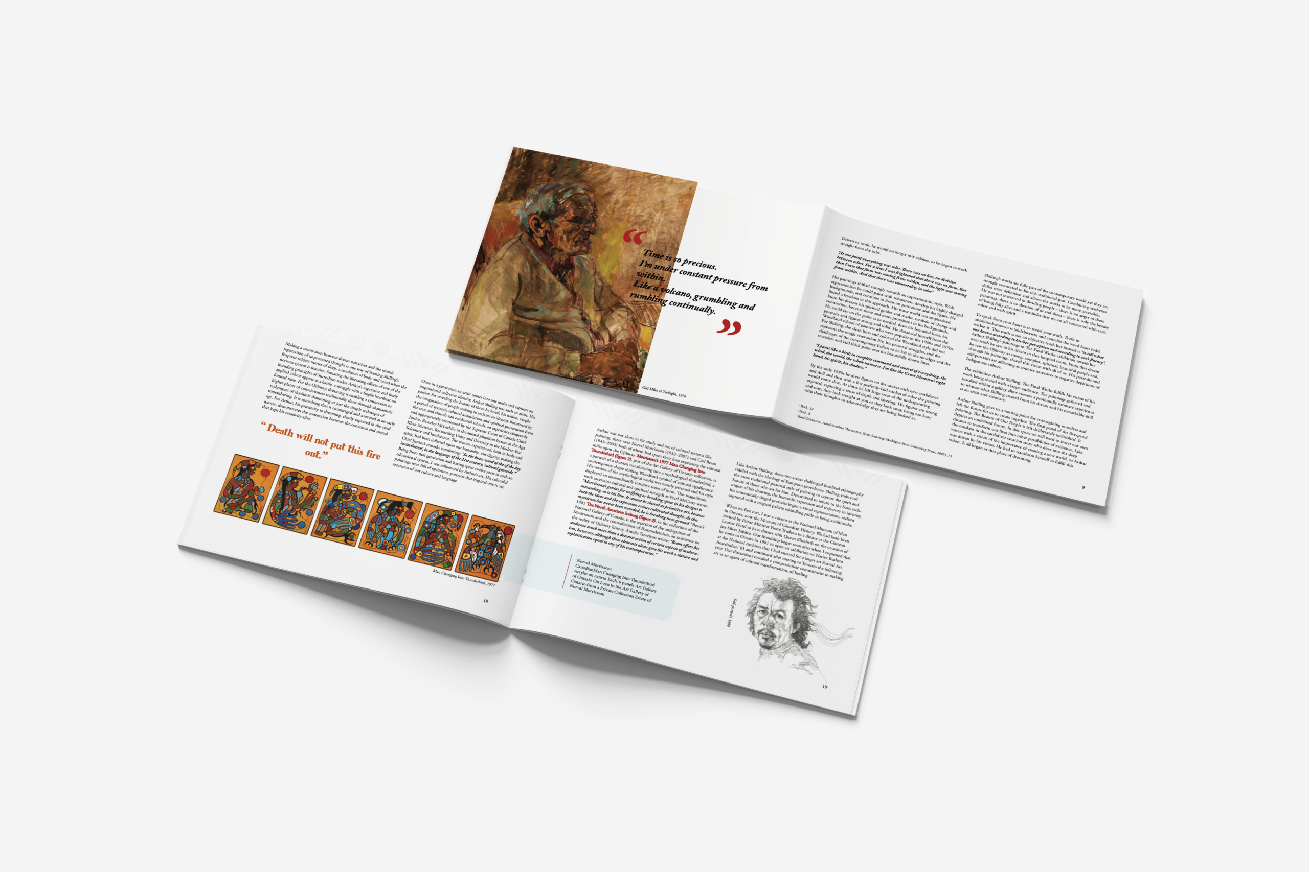
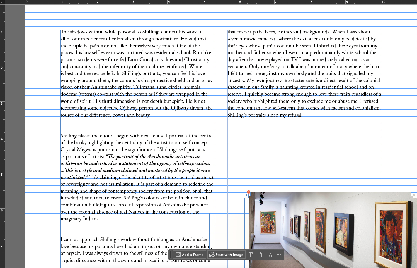
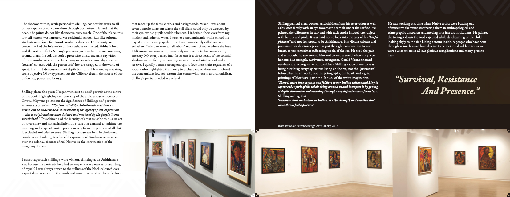
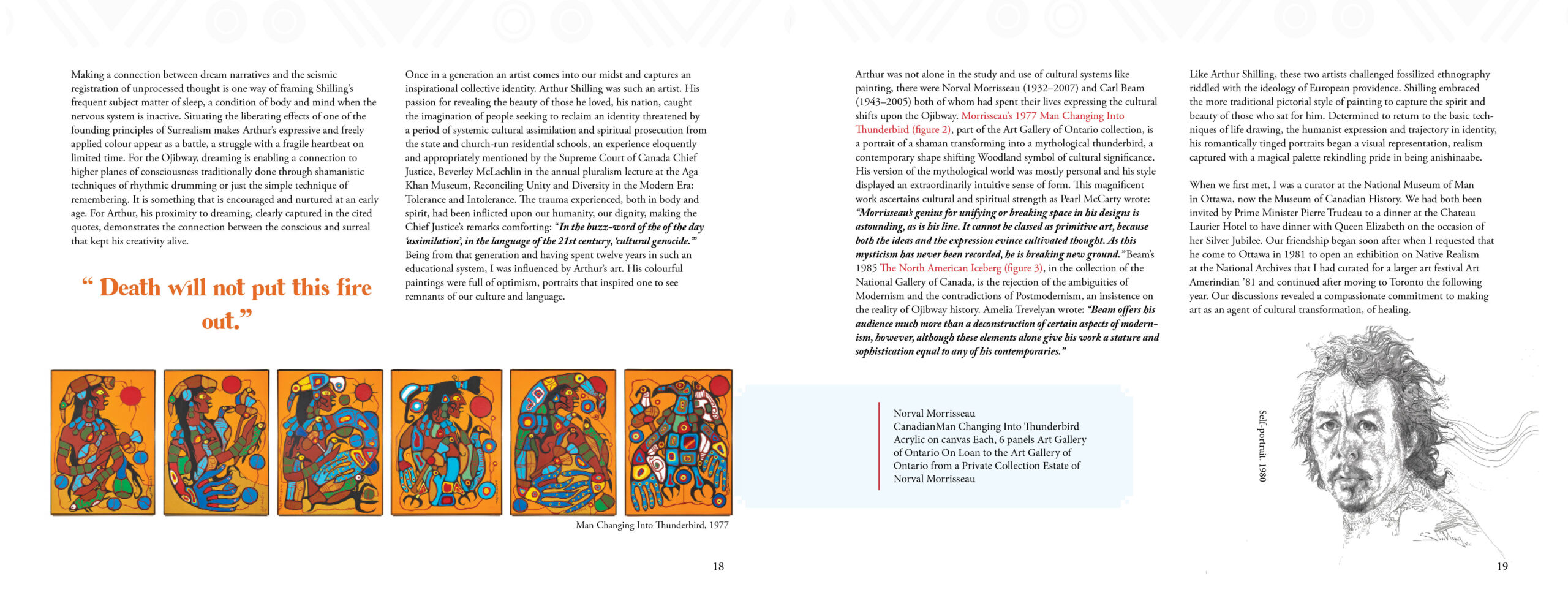
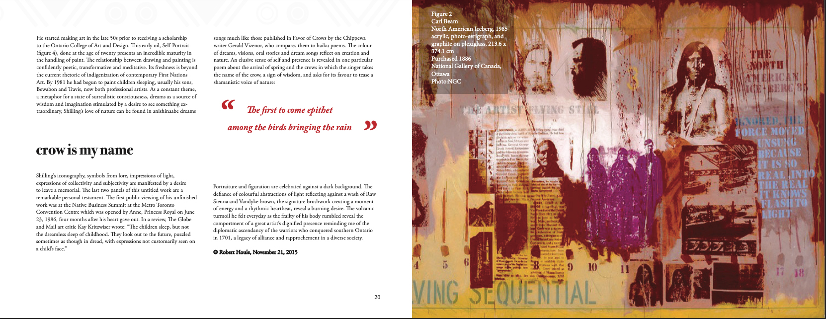
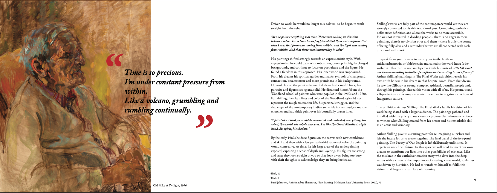
Exhibition Catalogue Design (school project)

An exhibition catalogue built around the final works of Arthur Shilling, emphasizing typographic clarity and narrative pacing.
The layout balances structure and quiet visual rhythm to support reflection and archival presence.

Jibril

Panke Culture — Berlin Music Event Poster

Design for a live music event hosted at Panke Culture in Berlin.The visual direction combines experimental typography, Arabic and Latin letterforms, distorted geometry, and underground club aesthetics inspired by Berlin’s independent music scene. The visual language was partially inspired by Op Art movements and the geometric optical distortions found in the work of Victor Vasarely and Bridget Riley.

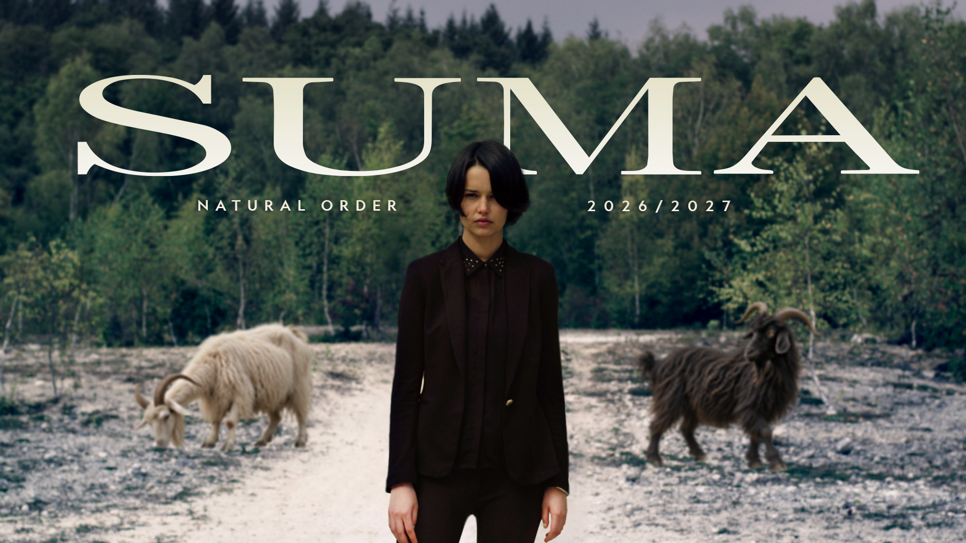
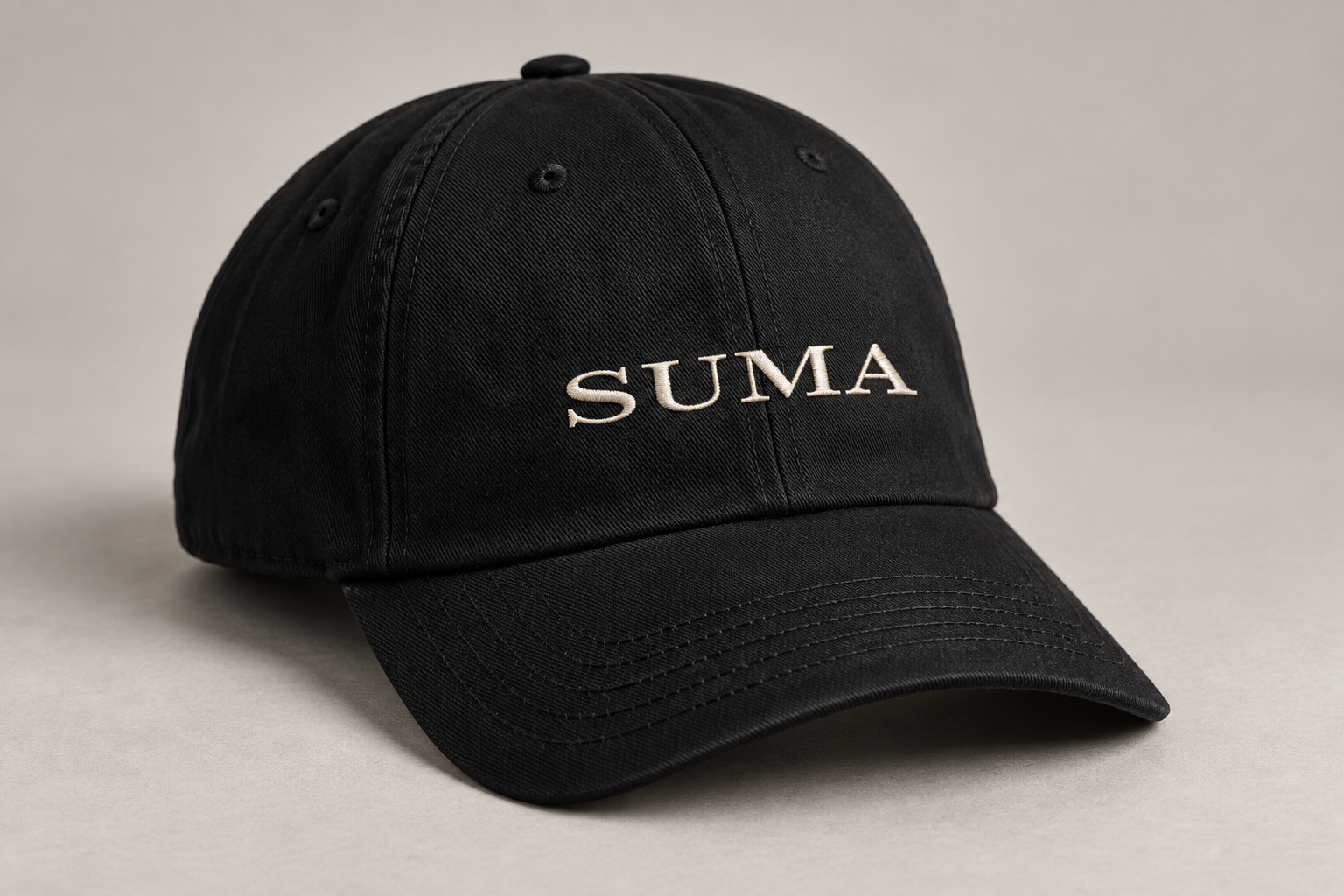
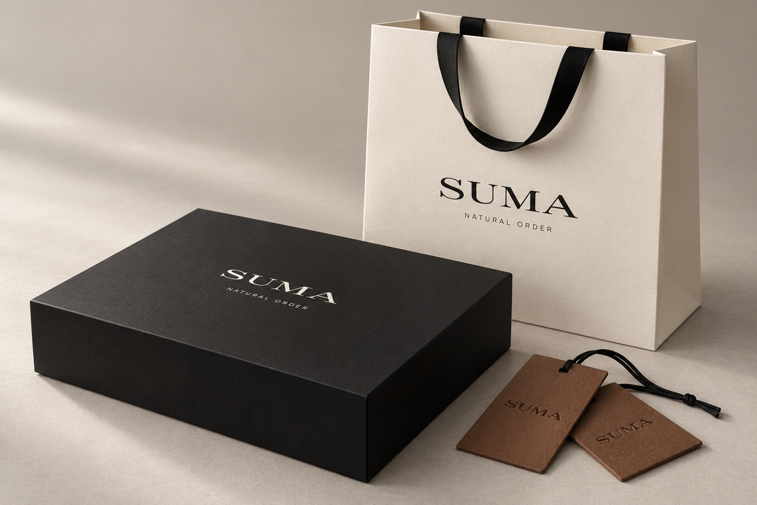
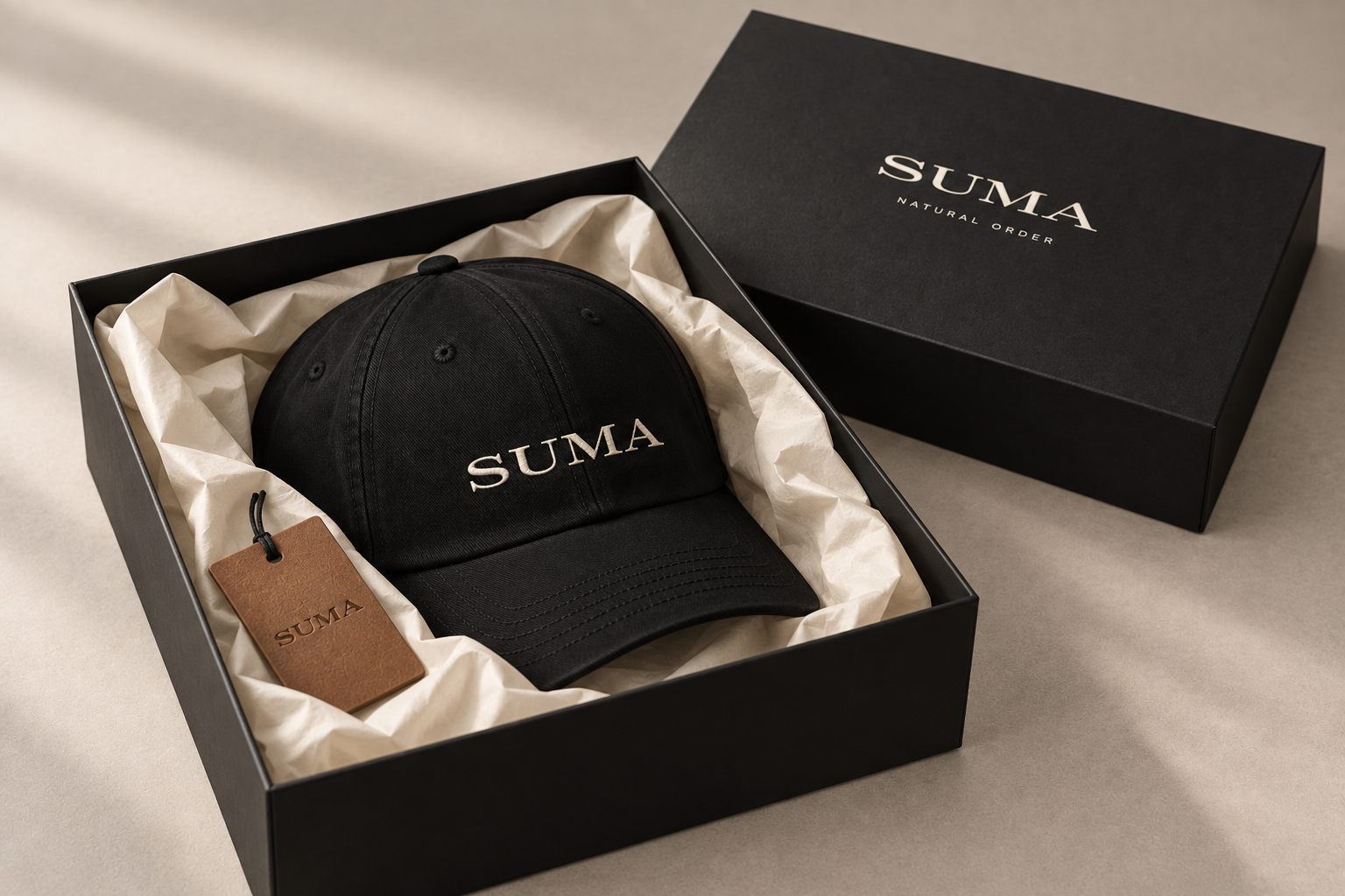
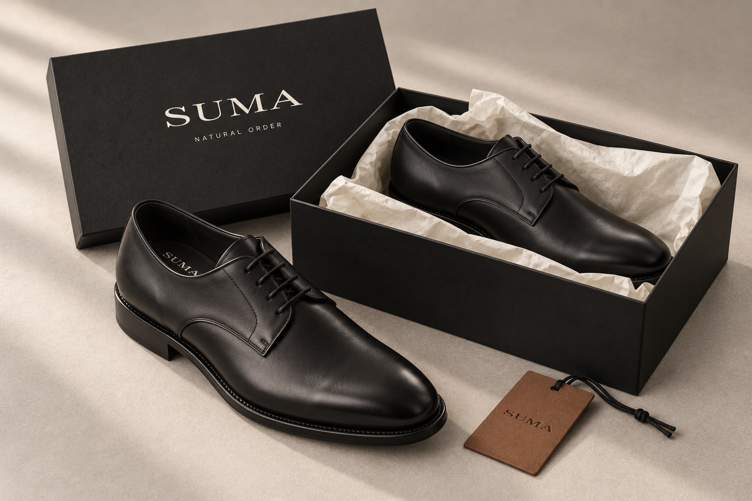
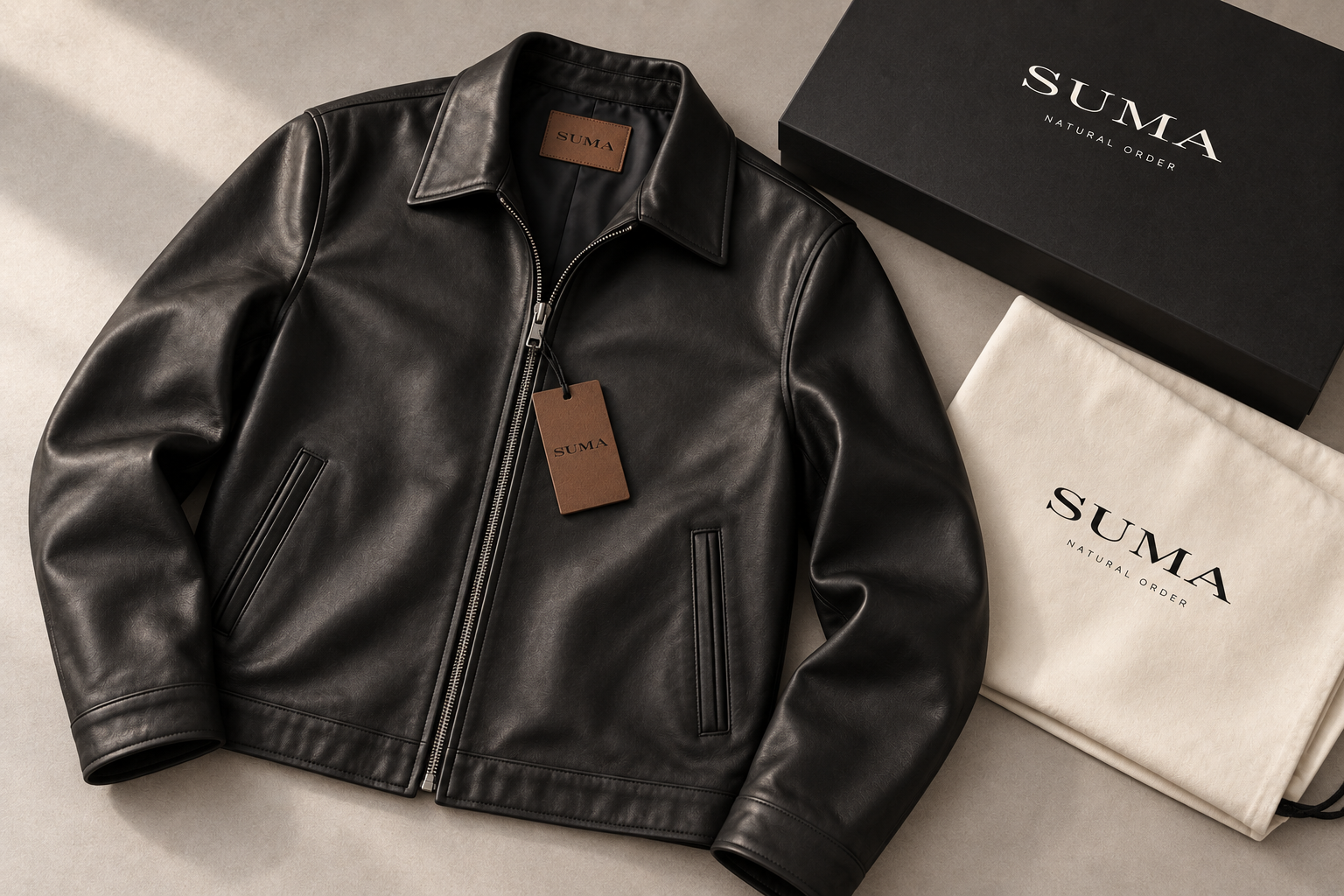
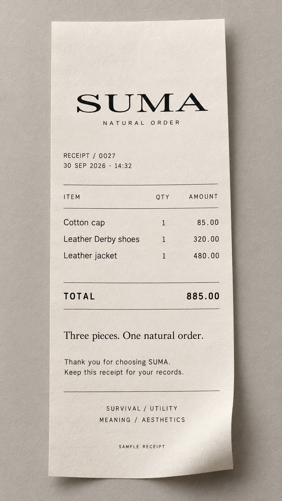
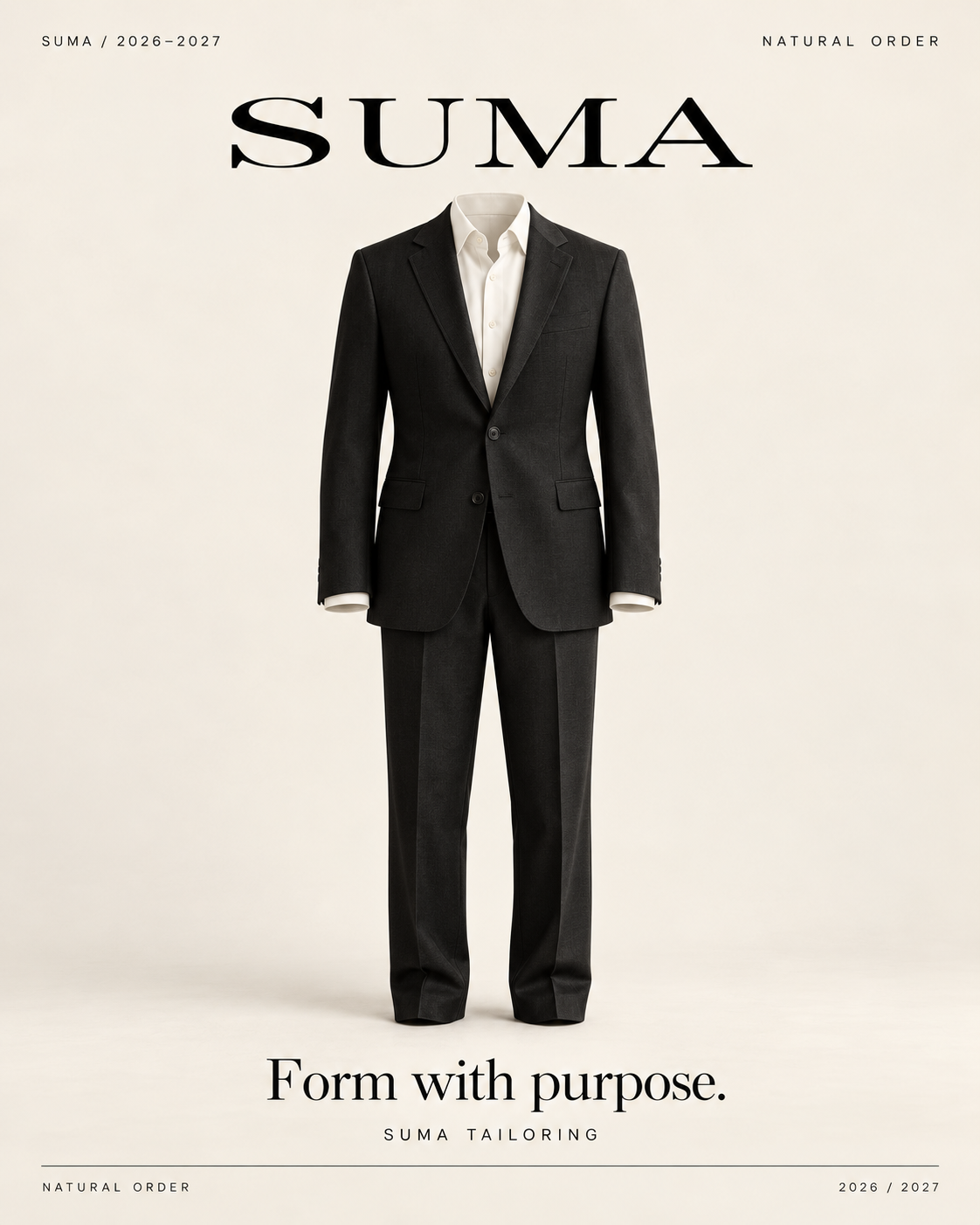
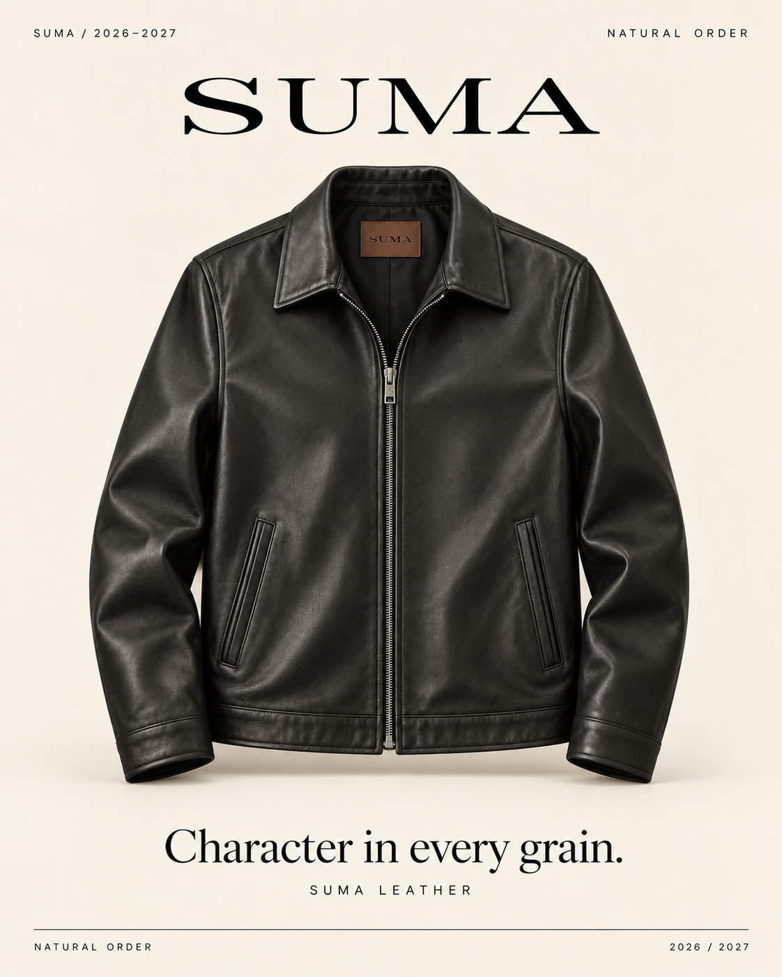
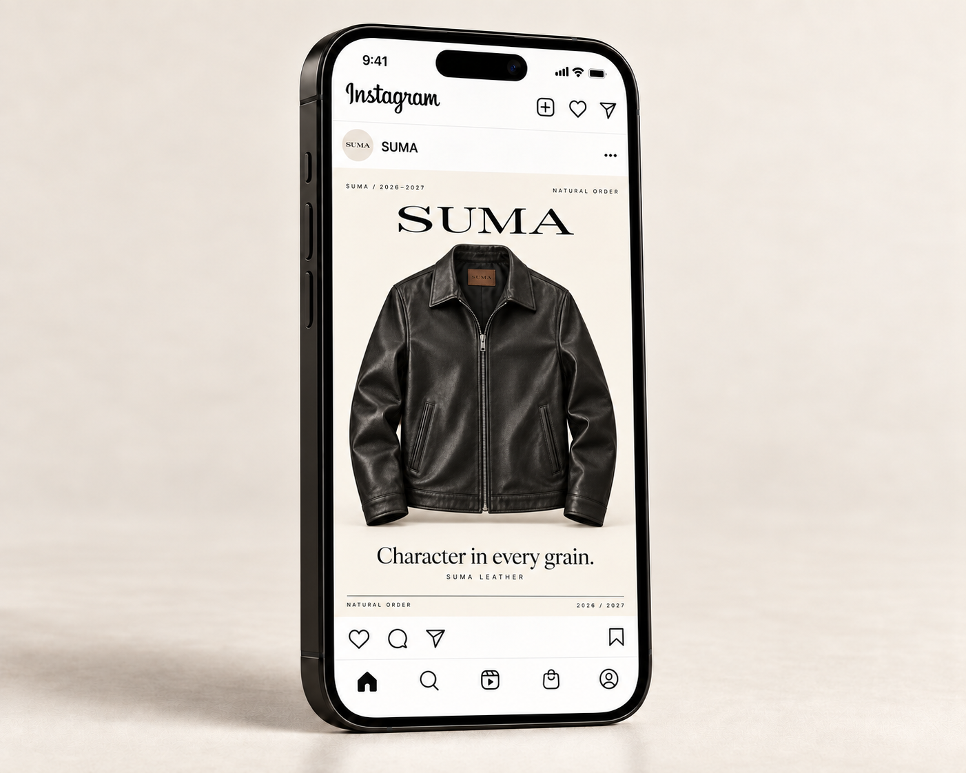
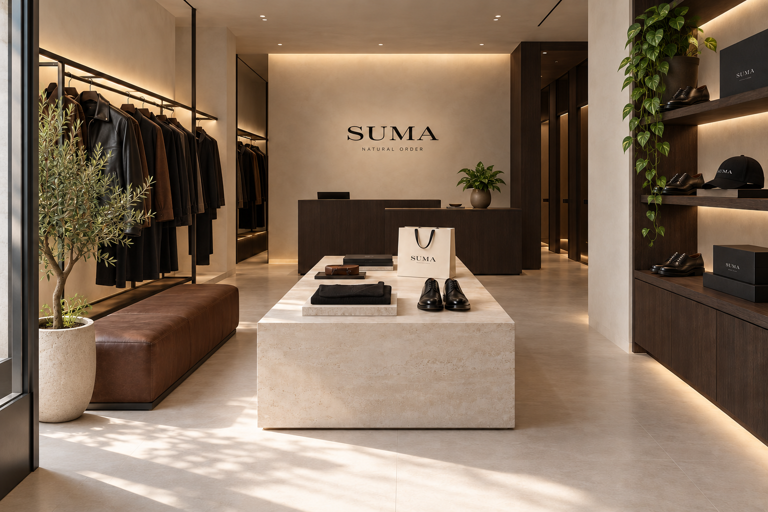
Suma

fashion brand system idea

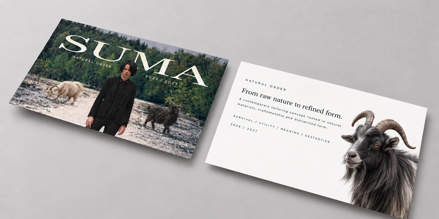
SUMA explores the evolution of human clothing from natural materials to modern refinement. Inspired by leaves, leather, wood, and raw earth textures, the brand reflects humanity’s continuous relationship with nature through structured tailoring and leather garments.ansition from primitive survival to modern refinement.

brand naming

color palette

#216B9B

BURNT LEATHER

Represents earth, skin, and early handcrafted pigments.

#0E0E0E

BLACK

Symbolizes transformation, refinement, and modern production.

#2B2B00

MUTED OLIVE

Inspired by leaves, forests, and humanity’s first garments.

#2B2B2B

CHAROCOAL WOOL

Reflects raw minerals, ash, and industrial evolution.

#E9E5DB

IVORY BONE

References natural fibers, bone, and untreated materials.

#7A4E36

SADLE BROWN

Inspired by animal leather and traditional craftsmanship

Product Digital & Packaging MOCK-UPs

Architectural Expression ( Exterior & Interior )

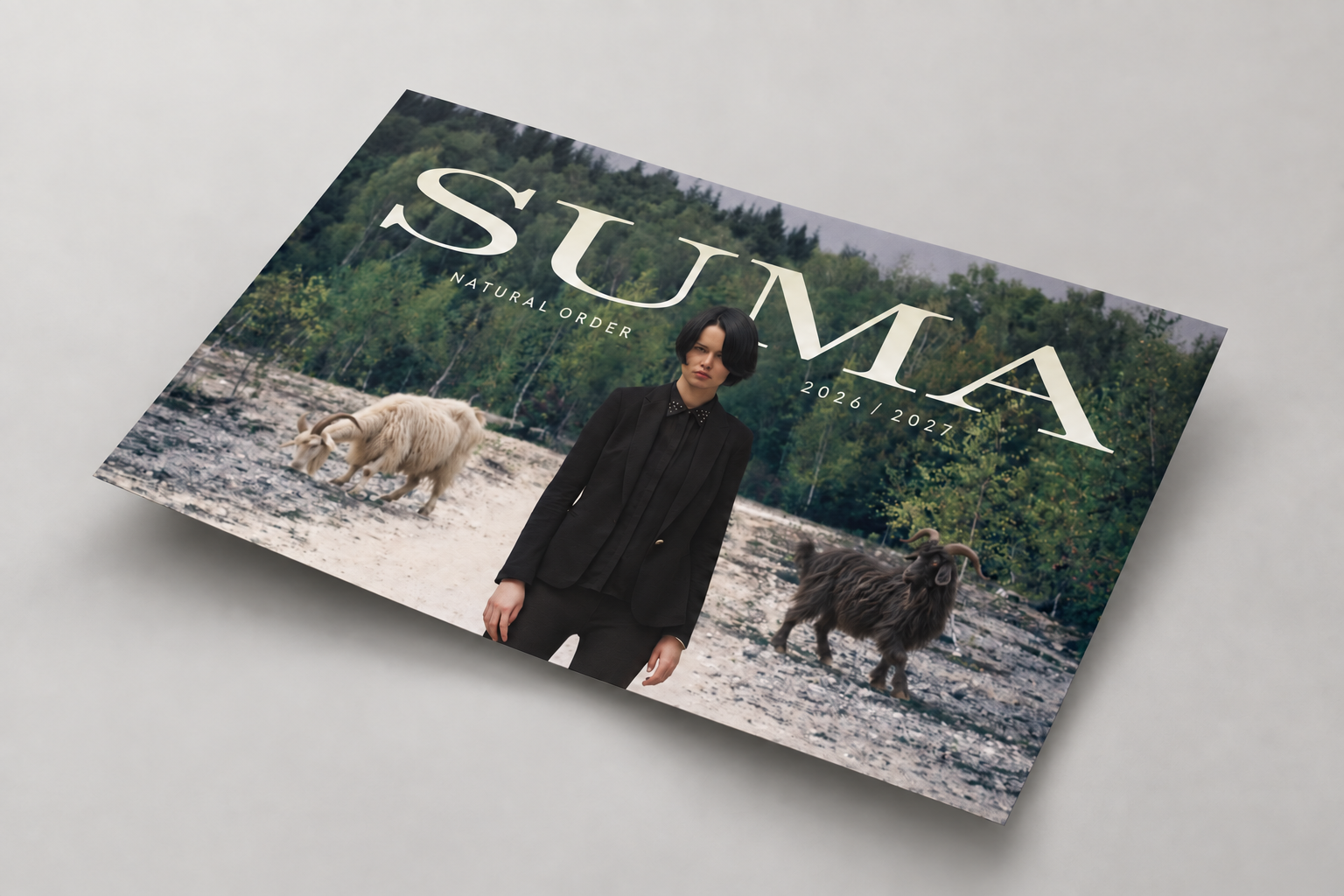
Campaign ad — Natural Order

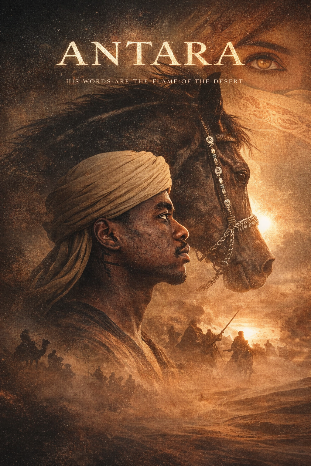
movie concept poster design

ANTARA

A cinematic concept poster inspired by the legend of Antara, exploring themes of heritage, identity, and inner strength.
Layered desert textures and symbolic imagery create an epic visual narrative that feels both timeless and deeply personal.

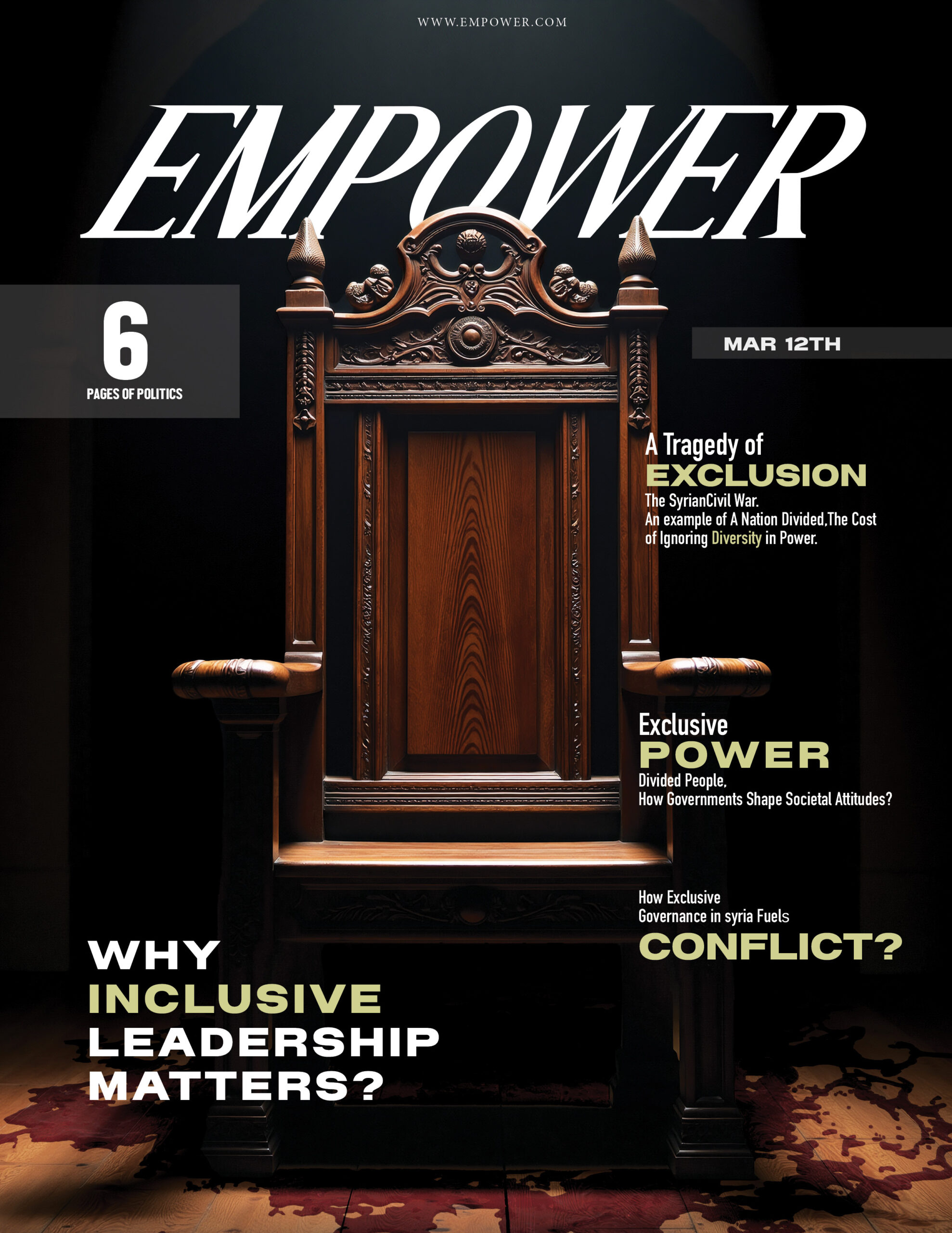
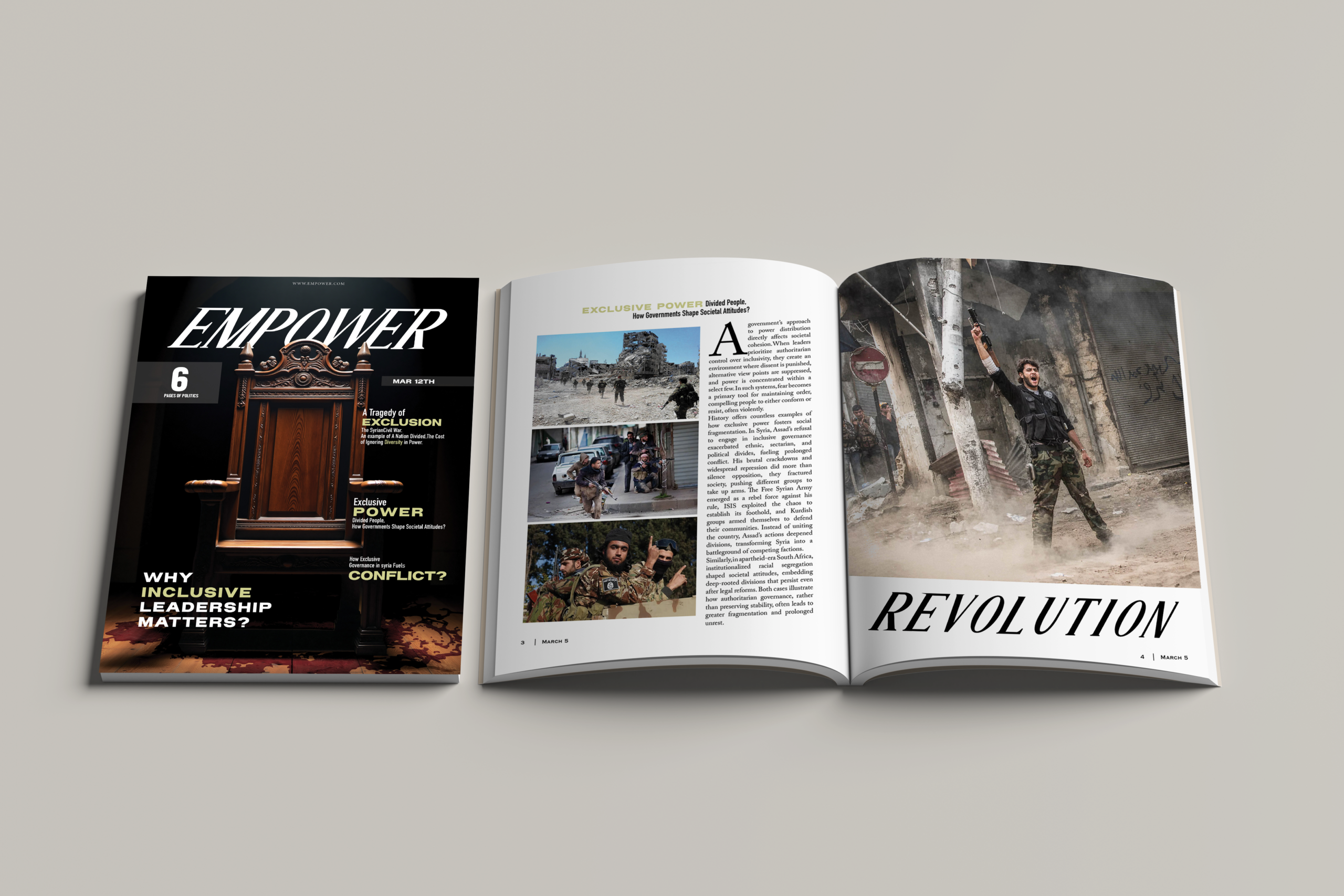
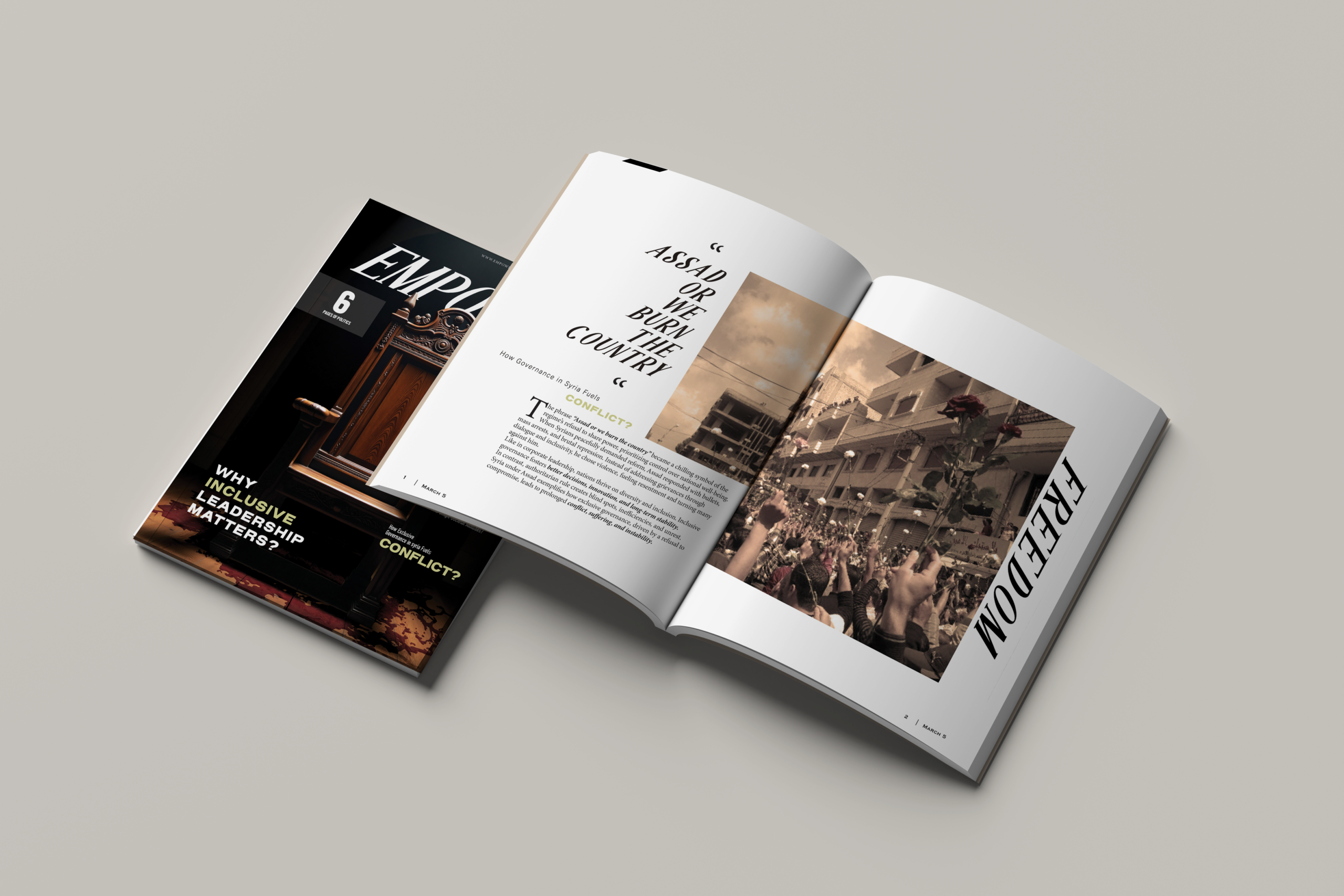
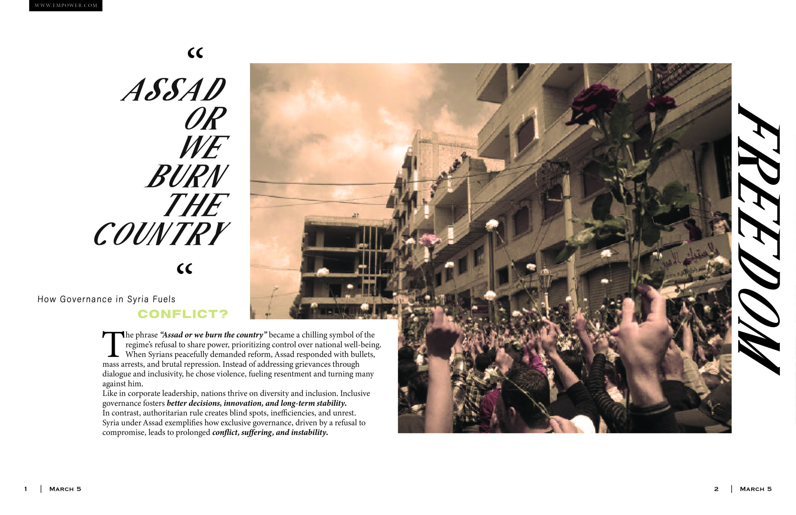
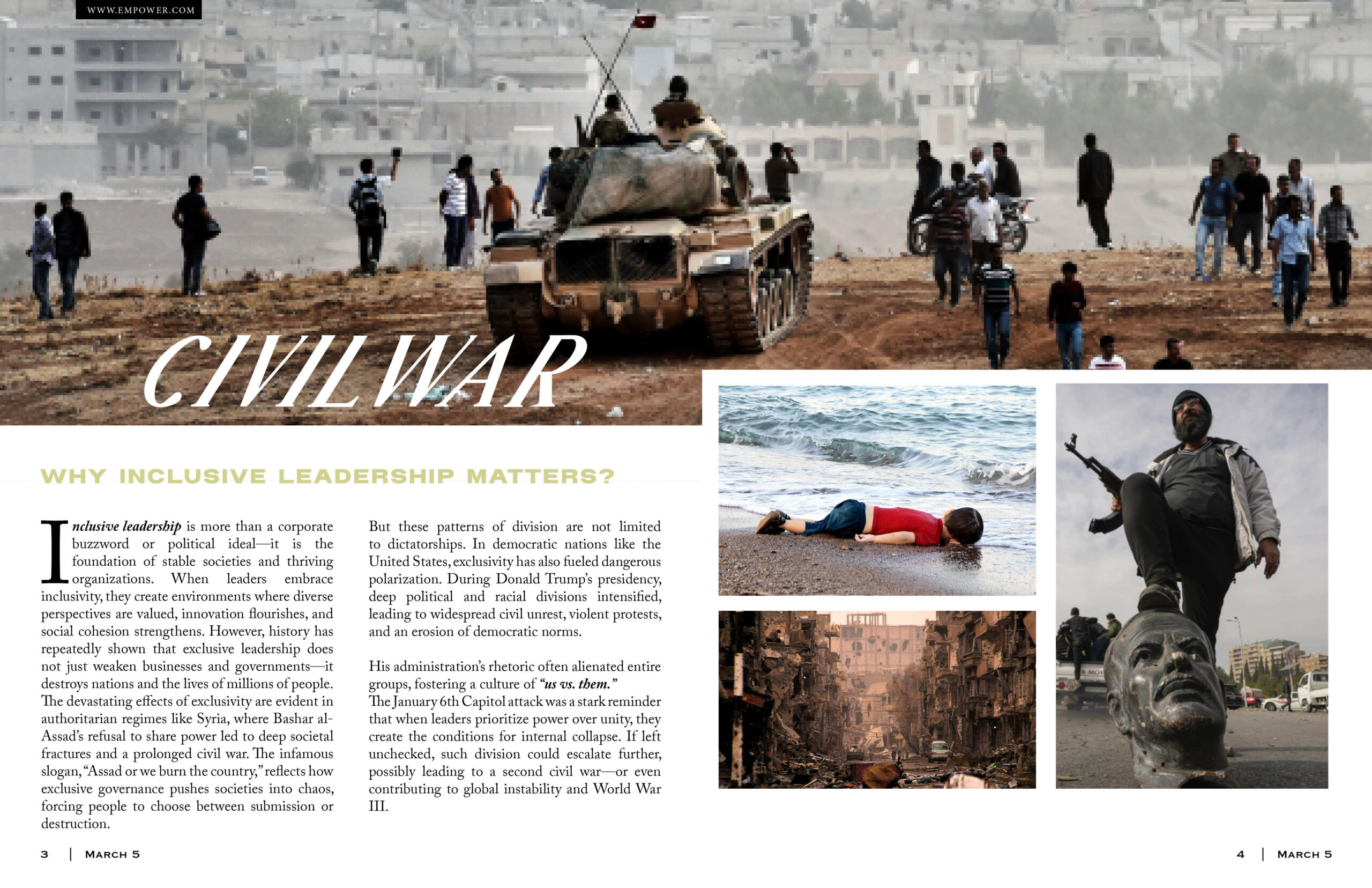
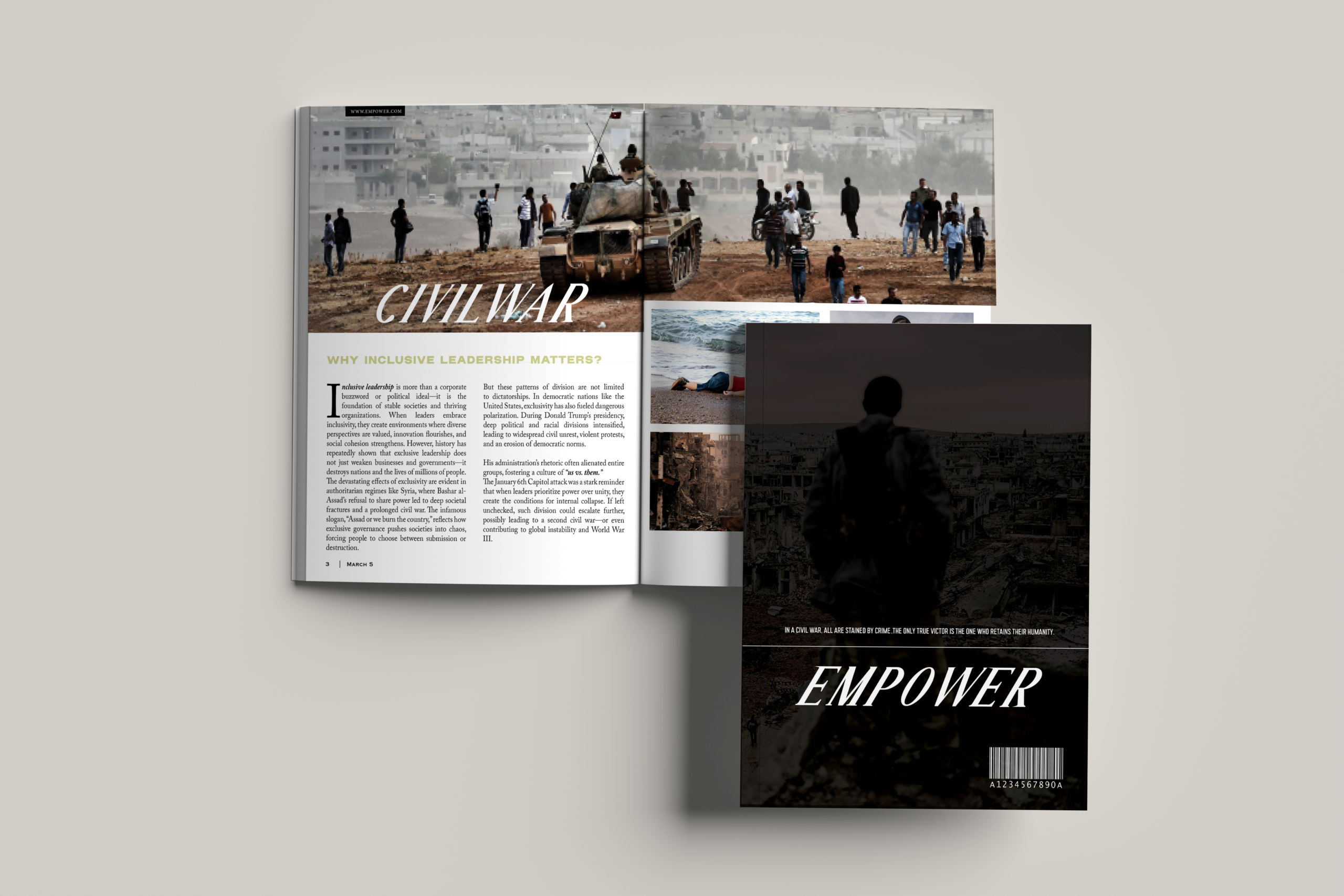
empower – magazine design

empower

conceptual magazine cover using the throne as a symbol of power, exclusion, and access.
Cinematic lighting and restrained typography create a tense editorial narrative around hierarchy and authority.

VISUAL EXPLORATIONS

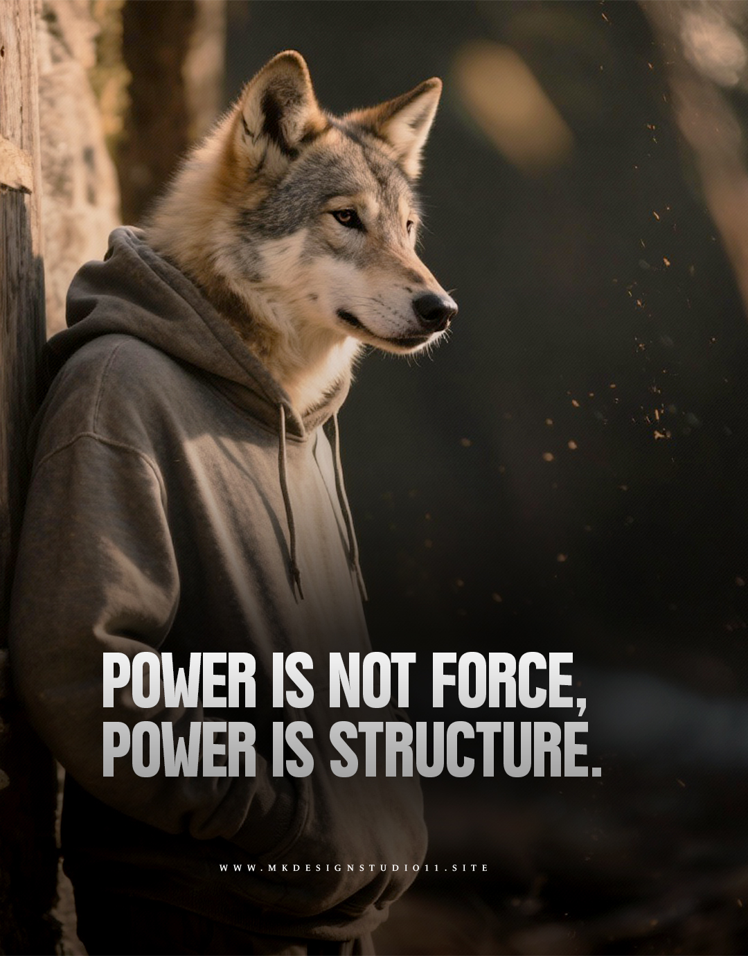
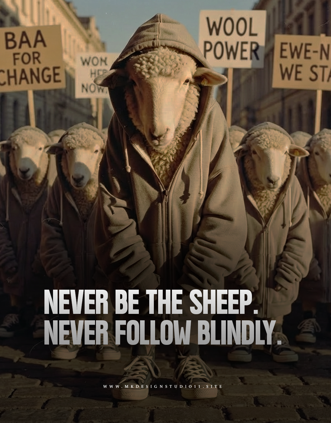
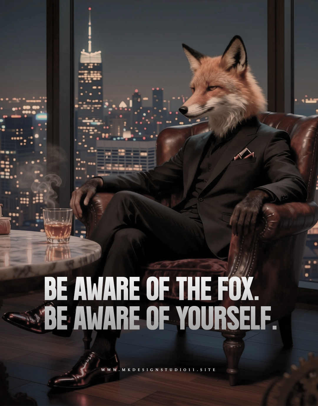
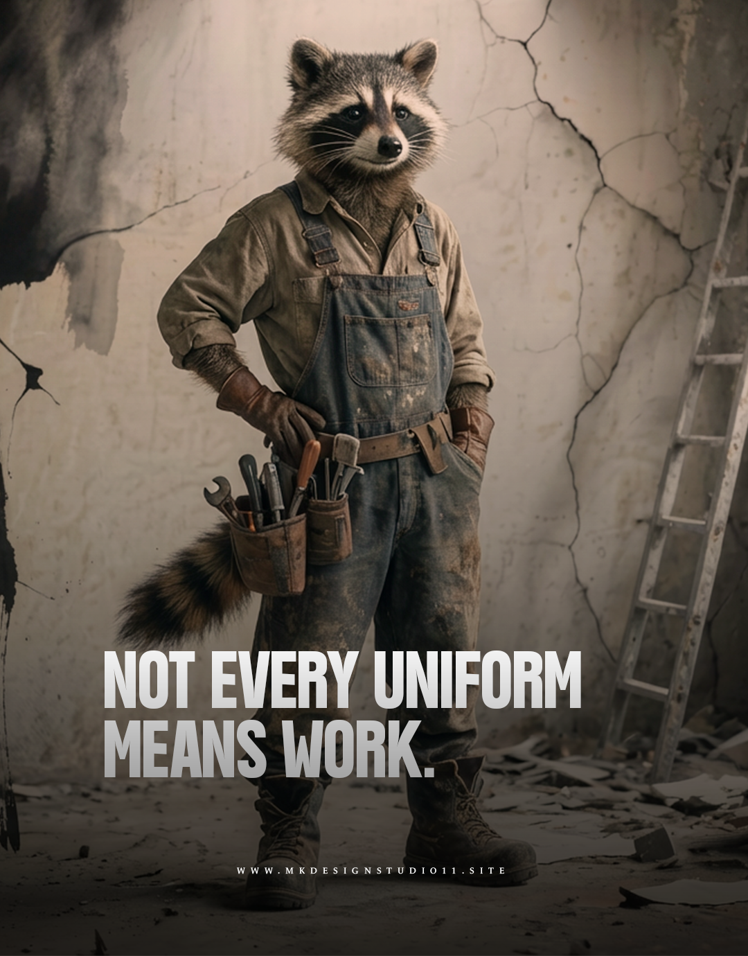
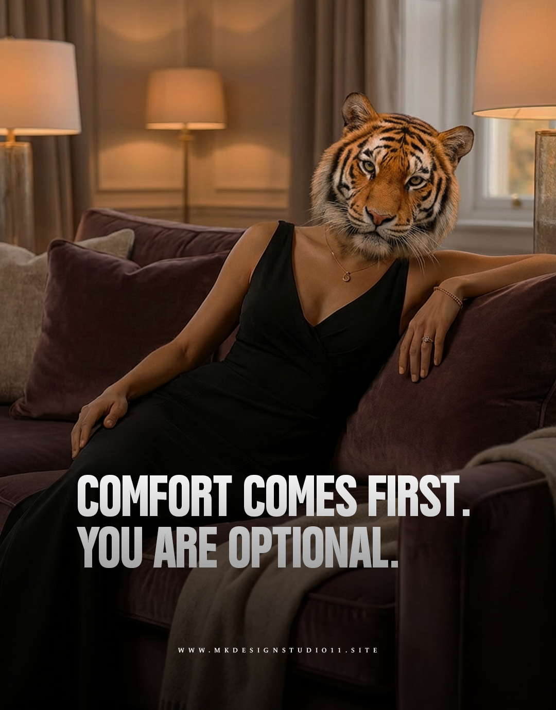
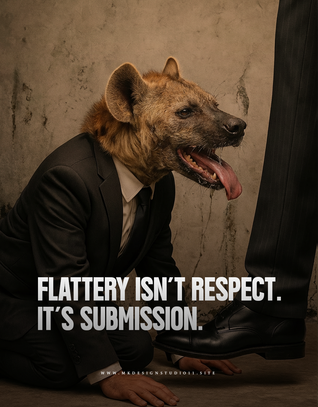
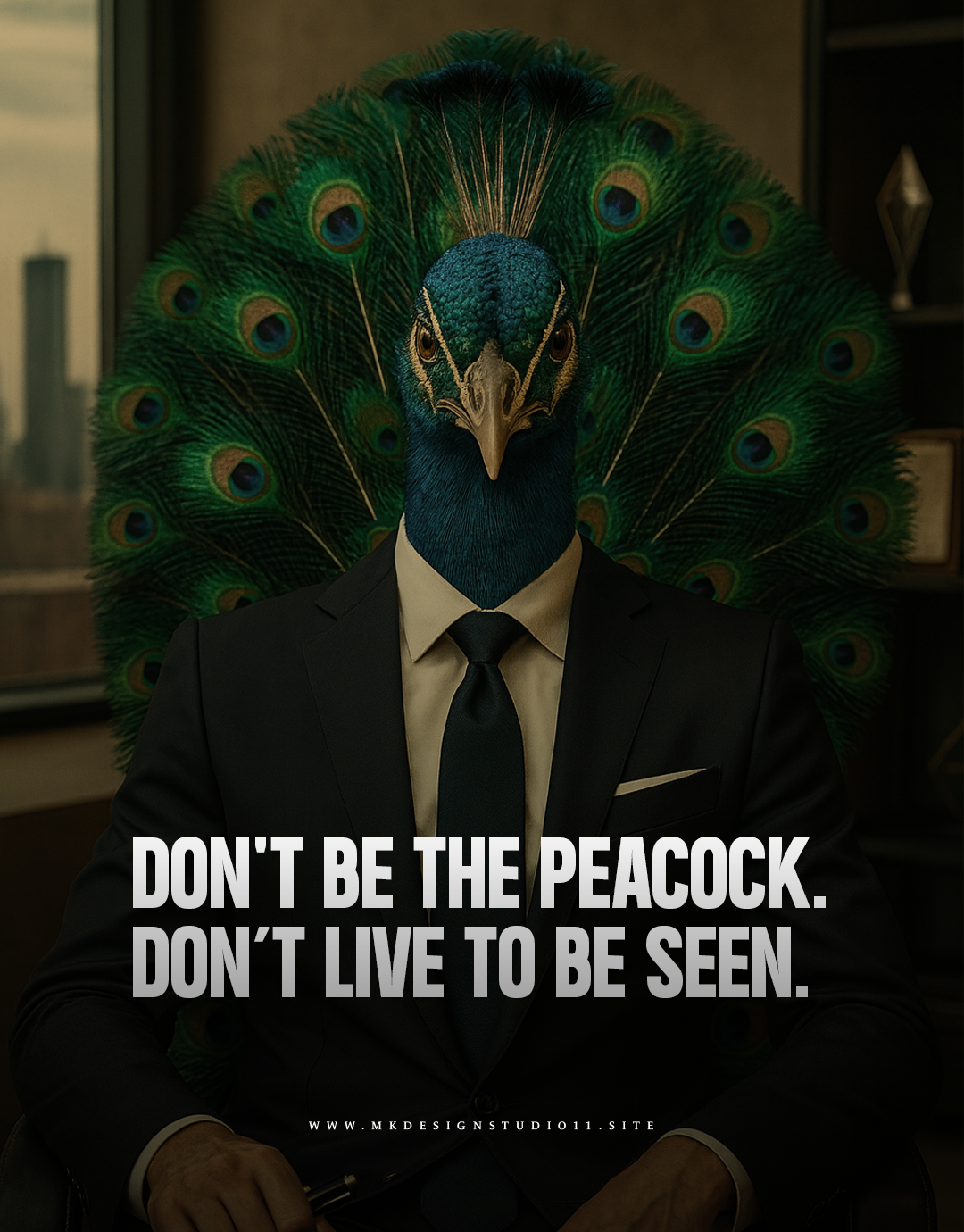
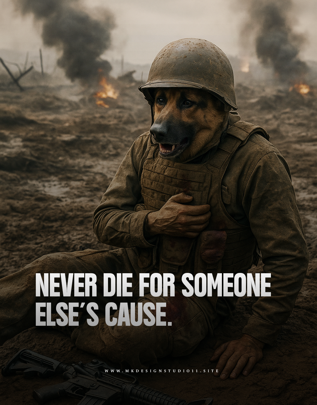
HUMAN JUNGLE

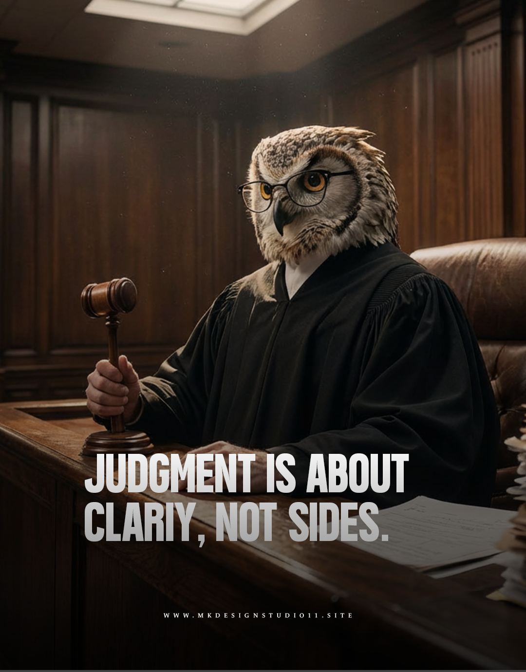
A conceptual poster series using animal symbolism to explore power, behavior, and self-awareness in modern society. Each piece reflects a psychological archetype shaped by authority, instinct, and choice.

DEMAGOGUERY

NATIONS ARE BUILT ON JUSTICE